 Skip to content
 An architecture student aesthetic is not a style. It is a way of seeing. It is black paper, white ink, trace paper overlays, and model-making dust on a desk. It is the beauty of process — the beauty of thinking out loud. Architecture students do not make finished buildings. They make drawings, models, diagrams, and collages. These things have their own aesthetic.
These 12 architecture student aesthetic ideas span drawing techniques, model-making methods, and presentation styles. Each idea includes defining characteristics, student strategies, and portfolio approaches.
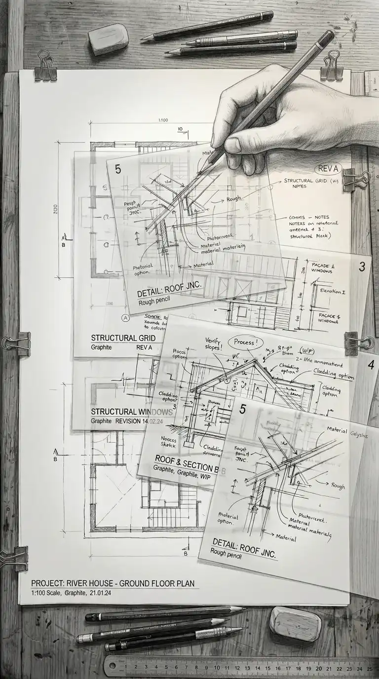
1. The Trace Paper Overlay
Trace paper is the architecture student’s sketchbook. It is translucent, cheap, and forgiving. Draw on trace, layer it over another drawing, trace again. The trace paper overlay is layered, translucent, and iterative.
This aesthetic is ideal for process drawings and design development. The emotional effect is layered, translucent, and iterative.
Quick Tips
- Use trace paper for all early sketches.
- Layer multiple sheets to develop an idea.
- Keep the overlays — they show your process.
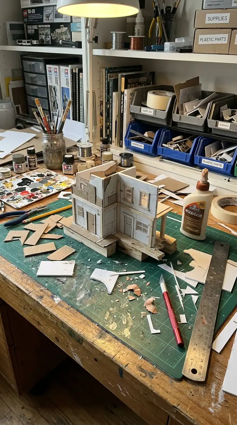
2. The Model-Making Desk
The model-making desk is a mess. Cardboard scraps, foam core offcuts, glue, knives, and metal rulers. The desk is not clean — it is productive. The model-making desk is messy, productive, and hands-on.
This aesthetic is ideal for process photography and portfolio documentation. The emotional effect is messy, productive, and hands-on.
Quick Tips
- Do not clean the desk for the photo.
- Show tools, scraps, and the model.
- The mess shows work.
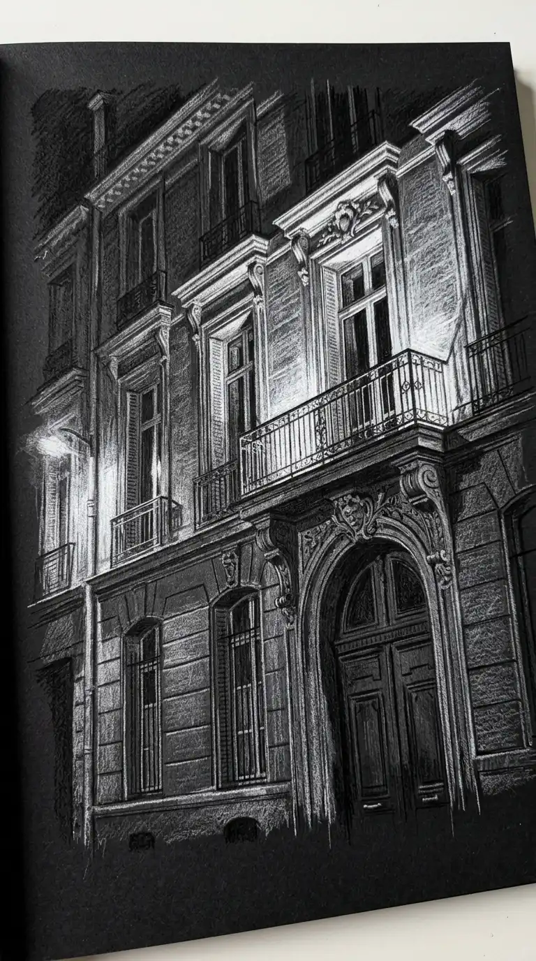
3. The Black Paper Drawing
Black paper drawing is drawing with white pencil or ink on black paper. The drawing is luminous, dramatic, and inverted. Black paper drawing is ideal for night scenes, shadows, and dramatic effects.
This aesthetic is ideal for final presentations and dramatic drawings. The emotional effect is luminous, dramatic, and inverted.
Quick Tips
- Use white pencil, chalk, or gel pen on black paper.
- Leave large areas of black for contrast.
- Build up white in layers for highlights.
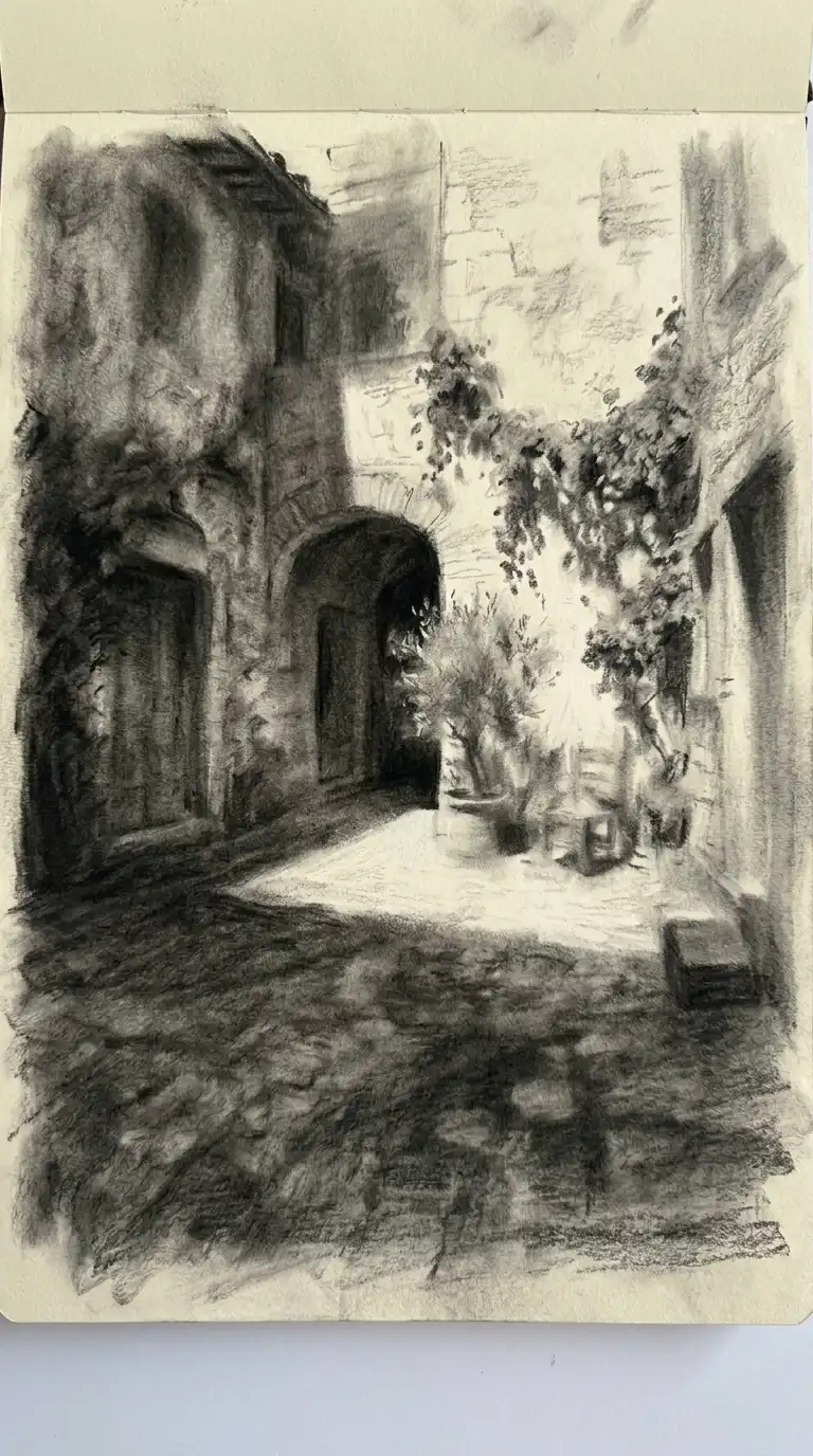
4. The Charcoal Smudge
Charcoal is soft, dark, and smudgy. Charcoal drawings are not precise — they are atmospheric. Use the side of the charcoal stick. Smudge with your finger or a stump. The charcoal smudge is tonal, atmospheric, and dark.
This aesthetic is ideal for shadow studies and atmospheric sketches. The emotional effect is tonal, atmospheric, and dark.
Quick Tips
- Use soft charcoal (4B-6B) for dark values.
- Blend with a stump or tissue for smooth transitions.
- Erase highlights with a kneaded eraser.
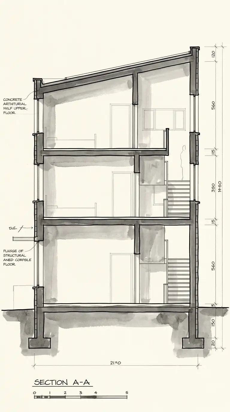
5. The Ink Wash Section
The ink wash section combines line drawing with diluted ink washes. The section is drawn in waterproof ink. The cut surfaces are filled with a grey ink wash. The ink wash section is graphic, tonal, and dramatic.
This aesthetic is ideal for sections and cutaway drawings. The emotional effect is graphic, tonal, and dramatic.
Quick Tips
- Use waterproof ink for the lines.
- Dilute ink in a palette for different grey values.
- Apply the wash with a brush, not a pen.
6. The White Card Model
The white card model is made of white museum board or mat board. The model is clean, abstract, and elegant. No colour, no material — just form and shadow. The white card model is refined, abstract, and architectural.
This aesthetic is ideal for final presentations and portfolio photography. The emotional effect is refined, abstract, and architectural.
Quick Tips
- Use white museum board for walls, white mat board for the base.
- Cut openings with a sharp knife.
- Fill edges with white spackle or paint for a seamless look.
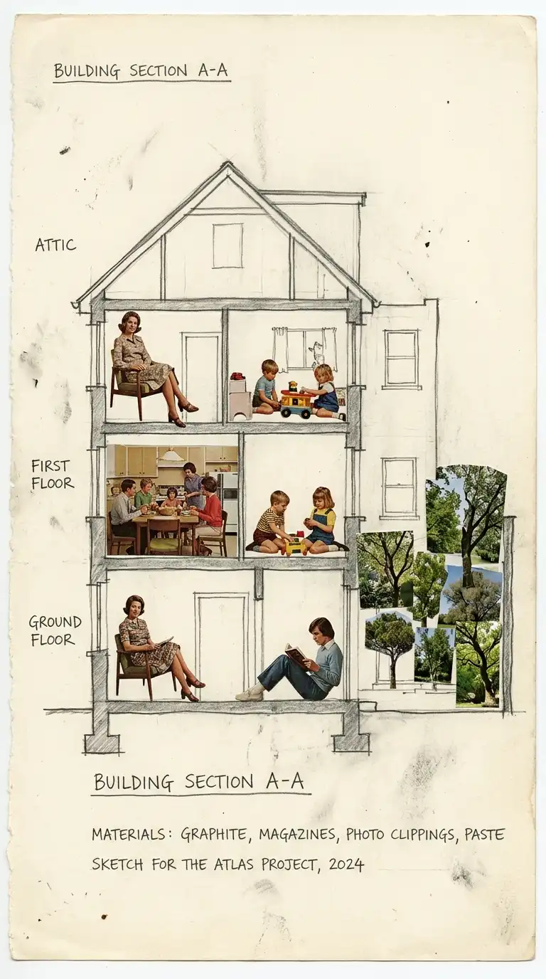
7. The Collage Section
The collage section combines a drawn section with cut-out images from magazines. A figure cut from a magazine, a tree from a photograph, a texture from a book. The collage section is layered, surprising, and poetic.
This aesthetic is ideal for conceptual presentations and portfolios. The emotional effect is layered, surprising, and poetic.
Quick Tips
- Draw the section accurately.
- Cut images from magazines, photographs, books.
- Glue or tape the images onto the drawing.
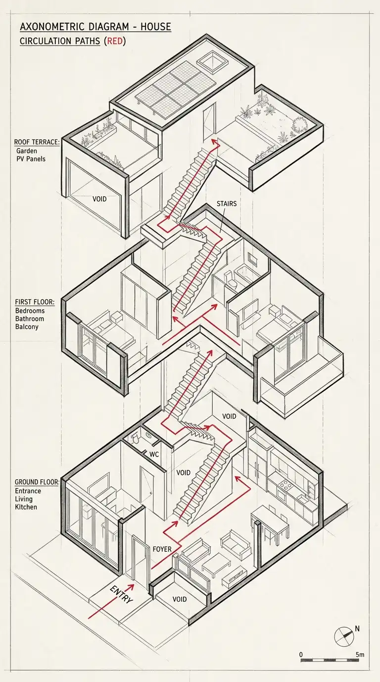
8. The Axonometric Diagram
The axonometric diagram is a measured three-dimensional drawing. All lines are parallel. No perspective. The axonometric is measurable and clear. The axonometric diagram is precise, clear, and diagrammatic.
This aesthetic is ideal for process diagrams and structural drawings. The emotional effect is precise, clear, and diagrammatic.
Quick Tips
- Use a consistent isometric or axonometric angle.
- Use different line weights for different elements.
- Add colour for clarity (red for circulation, blue for structure).
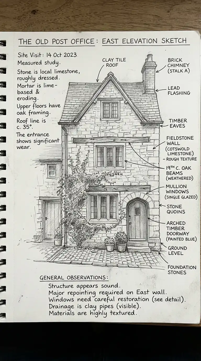
9. The Hand-Lettered Page
Hand-lettered pages have no digital text. All labels, notes, and titles are handwritten. The handwriting is part of the aesthetic. The hand-lettered page is personal, authentic, and crafted.
This aesthetic is ideal for sketchbooks and process portfolios. The emotional effect is personal, authentic, and crafted.
Quick Tips
- Write neatly — hand lettering is part of the aesthetic.
- Use consistent letter height and spacing.
- Integrate text into the drawing, not just in the margin.
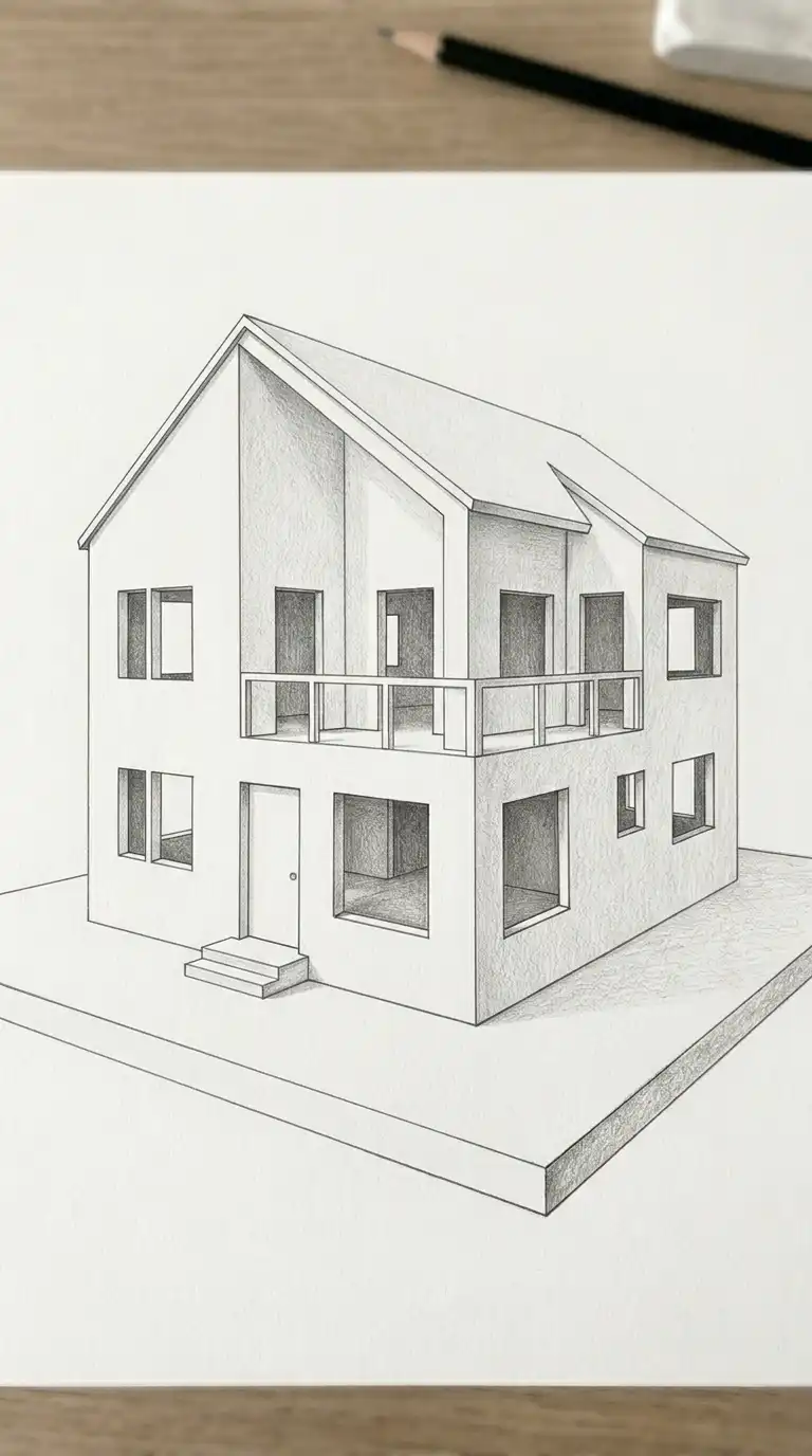
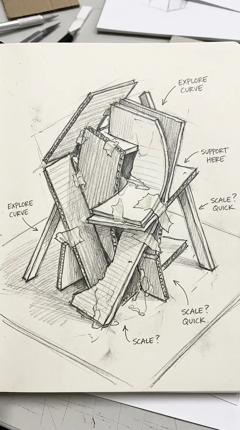
10. The Study Model
The study model is quick, rough, and cheap. Made of foam core, cardboard, or clay. No finish, no detail. The study model is about form, not presentation. The study model is quick, rough, and generative.
This aesthetic is ideal for process documentation and design exploration. The emotional effect is quick, rough, and generative.
Quick Tips
- Do not spend more than 15-20 minutes on a study model.
- Use cheap, easily worked materials.
- Make many models, not one perfect one.
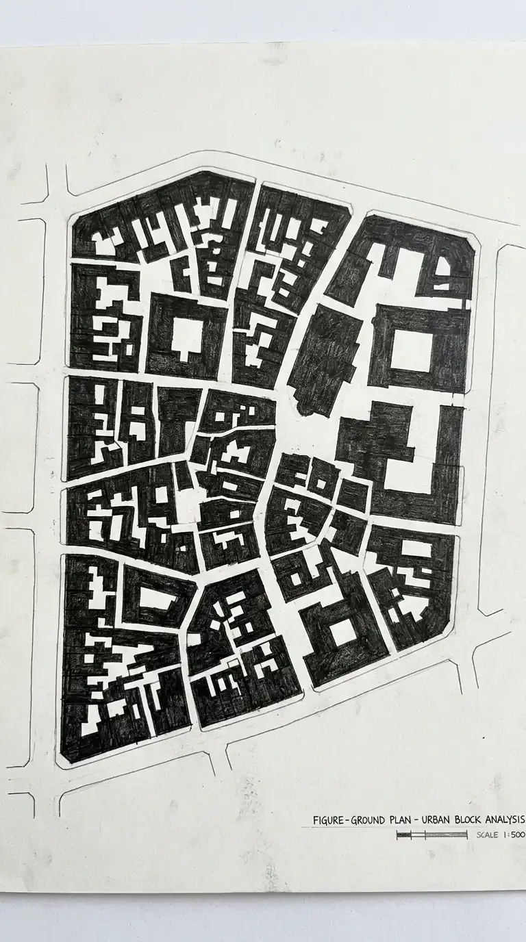
11. The Figure-Ground Plan
The figure-ground plan shows buildings as solid black masses and open space as white. The drawing is a map of solid and void. The figure-ground plan is graphic, abstract, and urban.
This aesthetic is ideal for urban analysis and site plans. The emotional effect is graphic, abstract, and urban.
Quick Tips
- All buildings must be solid black.
- All open space must be white.
- No internal details — no windows, no courtyards.
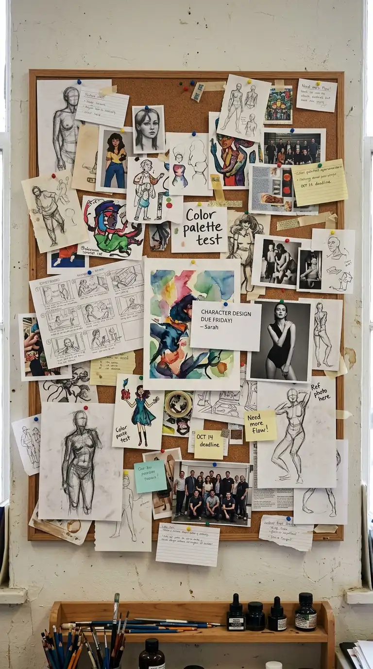
12. The Pin-Up Board
The pin-up board is a cork board or foam board covered in drawings, prints, and notes. Pins and tape hold everything in place. The pin-up board is a work in progress — a thinking wall. The pin-up board is messy, public, and collaborative.
This aesthetic is ideal for studio critiques and group work. The emotional effect is messy, public, and collaborative.
Quick Tips
- Pin up everything — good and bad.
- Overlap drawings and notes.
- The mess shows thinking.
Final Thoughts
These 12 student aesthetics are not mutually exclusive. A trace paper overlay can be pinned on a pin-up board. A white card model can be photographed on a model-making desk. A collage section can be hand-lettered. The best architecture student aesthetic is not the most polished — it is the most honest. It shows the work. It shows the process. It shows the thinking. It is the aesthetic of learning. It is the aesthetic of becoming an architect. It is the student aesthetic.
