18 Colorful Living Room Designs
Colorful Living Room Designs transforms living rooms from ordinary to extraordinary, injecting personality, energy, and joy into everyday spaces. While neutrals dominate many interiors, bold color choices create memorable rooms that reflect individual style and confidence. These eighteen designs celebrate color in all its forms—from single dramatic hues to vibrant multi-color palettes—proving that colorful living rooms can be sophisticated, elegant, and timelessly beautiful.
See also: Aesthetic Quote Posters for Bedroom 22 Ways to Elevate Your Walls
1. Jewel-Toned Elegance
Rich emerald green, sapphire blue, and amethyst purple create luxurious, saturated environments. Velvet upholstery and metallic accents amplify the opulent jewel box effect.

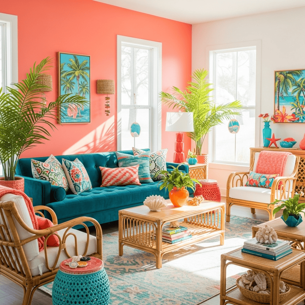
2. Coral and Teal Tropical Paradise
Vibrant coral paired with turquoise teal evokes tropical beaches and sunset skies. This energetic combination works beautifully with natural materials and abundant greenery.
See also: Guest Bedroom Ideas 14 Ways to Maximize Your Spare Room
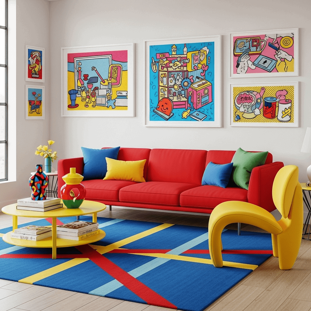
3. Bold Primary Colors Pop Art
Embrace primary colors—red, yellow, blue—for playful, energetic spaces inspired by pop art. Graphic patterns and clean lines prevent childish associations.
4. Sunset Ombre Wall
Gradient paint techniques create flowing color transitions from warm orange through pink to deep purple, mimicking stunning sunsets. This artistic approach adds unique personality.

5. Maximalist Rainbow Explosion
Layer every color imaginable for joyful maximalist spaces. Mix patterns, textures, and hues fearlessly while maintaining intentional composition rather than random chaos.

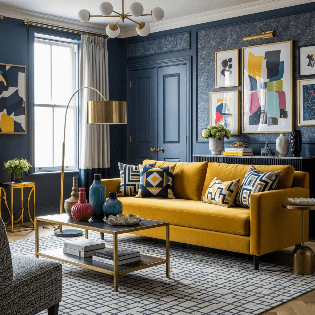
6. Mustard and Navy Sophistication
Warm mustard yellow against deep navy blue creates sophisticated contrast. This combination feels both vintage and contemporary, elegant and approachable.
7. Peacock Blue Statement
Deep peacock blue walls or furniture create dramatic, jewel-toned focal points. Balance with metallics, neutrals, and complementary accent colors for cohesive sophistication.

8. Pink and Green Garden Fresh
Combine blush or hot pink with sage or emerald green for fresh, botanical-inspired spaces. This unexpected pairing feels both modern and naturally harmonious.

9. Burnt Orange Bohemian
Rich burnt orange, rust, and terracotta create warm, enveloping bohemian environments. Layer with global textiles, plants, and natural materials for eclectic personality.

10. Electric Blue Modern
Vibrant electric blue makes bold contemporary statements. Use as accent wall color, upholstery, or artwork against white or grey for maximum impact.

11. Multi-Colored Gallery Wall
Create colorful impact through curated gallery walls featuring diverse artwork in various hues. This approach adds color without commitment to painted walls or large furniture.

12. Lavender and Gold Glamour
Soft lavender with gold metallics creates romantic glamour without excessive sweetness. This sophisticated pairing works in both contemporary and traditional settings.

13. Color Block Geometric
Use painter’s tape to create bold geometric color blocking on walls—triangles, rectangles, or abstract shapes in multiple coordinating colors for modern artistic impact.

14. Turquoise Mediterranean
Bright turquoise evokes Mediterranean seas and Greek islands. Pair with white, natural woods, and terracotta for vacation-inspired, perpetually sunny spaces.

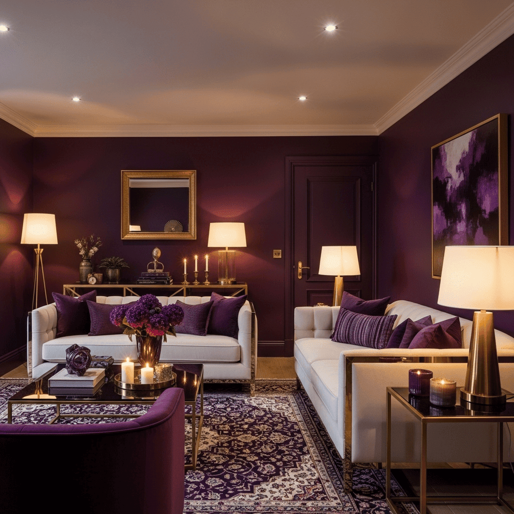
15. Deep Plum Sophistication
Rich plum or aubergine purple creates moody sophistication. Balance dramatic color with lighter furniture and ample lighting to prevent darkness.
16. Citrus Brights Kitchen-Living
Combine lemon yellow, lime green, and orange for energetic, appetite-stimulating spaces. This palette particularly suits open-concept kitchen-living areas.

17. Ombre Textile Layering
Create colorful impact through textiles rather than paint—ombre curtains, gradient pillows, color-graduated throws that transition through color families.

18. Color Drenching Monochrome
Paint everything—walls, ceiling, trim, even furniture—in varying shades of one bold color for enveloping, immersive monochromatic spaces with maximum impact.

The Psychology of Color in Living Rooms
Understanding color psychology helps create intentional, emotionally resonant spaces:
Warm Colors (Red, Orange, Yellow):
- Effects: Energizing, stimulating, sociable, appetite-inducing
- Best For: Social entertaining spaces, rooms needing energy, north-facing rooms lacking warmth
- Cautions: Can feel overwhelming in large doses; may increase perceived warmth in hot climates
Cool Colors (Blue, Green, Purple):
- Effects: Calming, relaxing, focusing, temperature-lowering perception
- Best For: Rooms for relaxation, south-facing rooms with abundant light, creating tranquility
- Cautions: Can feel cold without warm accents; dark blues and purples reduce perceived space
Bright/Saturated Colors:
- Effects: Joyful, energetic, attention-grabbing, mood-boosting
- Best For: Personalities who love boldness, rooms with abundant natural light, making statements
- Cautions: Can tire over time; difficult to coordinate; may overwhelm small spaces
Pastels/Soft Colors:
- Effects: Gentle, calming, romantic, optimistic without aggression
- Best For: Smaller spaces, bedrooms, creating peaceful environments, timid color lovers
- Cautions: Can feel juvenile if not balanced with sophisticated elements
Color Theory for Living Room Design
Complementary Colors: Opposite color wheel colors (blue/orange, red/green, yellow/purple) create vibrant, high-energy contrasts. Use in 60-30-10 proportions to prevent overwhelming spaces.
Analogous Colors: Adjacent color wheel colors (blue/green, orange/red, purple/blue) create harmonious, flowing spaces that feel naturally cohesive and easy on eyes.
Triadic Colors: Three equally-spaced color wheel colors (red/yellow/blue or orange/green/purple) create balanced, vibrant schemes when one dominates and others accent.
Monochromatic: Various shades, tints, and tones of one color create sophisticated, cohesive environments. Success requires varied textures and value contrasts.
Split-Complementary: One color plus two colors adjacent to its complement creates less tension than true complementary while maintaining vibrancy.
Implementing Color Confidently
Start with Inspiration: Begin with a favorite artwork, rug, or fabric featuring desired colors. Pull palette from pieces you already love rather than abstractly selecting colors.
Test Extensively: Paint large sample swatches (minimum 2’x2′) on multiple walls. Observe morning, afternoon, and evening as natural light dramatically affects color appearance.
Consider Proportions: The 60-30-10 rule provides balance—60% dominant color (often walls), 30% secondary color (large furniture), 10% accent color (accessories, pillows).
Account for Lighting: North light cools colors; south light warms them. East morning light brings warmth; west afternoon light adds golden tones. Artificial lighting (warm vs. cool bulbs) also affects color appearance.
Think Long-Term: Will you tire of bold color quickly? If uncertain, apply color through easily changeable elements (pillows, artwork, accessories) rather than walls or large furniture.
Balance Boldness: Surround vibrant colors with neutrals providing visual rest. All-color-everywhere overwhelms; strategic placement creates impact without fatigue.
Where to Apply Color
Painted Walls: Most impactful and cost-effective color application. Accent walls provide boldness without overwhelming; full-room color creates immersive environments.
Large Furniture: Colored sofas make strong statements. Consider fabric performance and whether you’ll tire of the color before furniture’s natural replacement cycle.
Accent Furniture: Chairs, ottomans, or side tables in bold colors add personality without major commitment or investment.
Textiles: Pillows, throws, curtains, and rugs introduce color flexibly. Change seasonally or when tastes evolve without major expense.
Artwork: Gallery walls or large statement pieces provide concentrated color impact while offering easiest update path.
Accessories: Vases, books, decorative objects introduce color in small, changeable doses perfect for cautious color lovers.
Color Mistakes to Avoid
Too Matchy-Matchy: Exact color matching looks forced. Vary shades—lighter walls, medium sofa, darker accents within same color family feels more sophisticated.
Ignoring Undertones: Colors have warm or cool undertones. Mixing unintentionally (warm red with cool pink) creates discord. Maintain consistent undertone temperature.
Insufficient Contrast: Low contrast between walls and furniture creates bland, flat spaces. Ensure adequate value differences for visual interest.
Neglecting Whites: Pure white often clashes with colors. Use warm whites (ivory, cream) with warm palettes; cool whites (grey-white) with cool colors.
Small Sample Testing: Paint chips lie—they’re too small to show true color. Always paint large samples observed over several days.
Forgetting Furniture Colors: Existing furniture colors must coordinate with new wall colors. Test paint next to actual furniture rather than imagining compatibility.
Seasonal Trends Only: Avoid choosing colors solely because they’re trendy. Trends fade; you’ll live with the color daily. Choose colors you genuinely love.
Creating Cohesion in Colorful Spaces
Repetition: Repeat accent colors throughout the room—if teal appears in pillows, echo it in artwork or accessories for cohesive flow.
Transitional Elements: Use multi-colored items (patterned rugs, artwork) that incorporate several room colors, bridging bold choices cohesively.
Grounding Neutrals: Neutral floors, ceilings, or large furniture pieces ground colorful schemes, preventing chaotic feelings.
Consistent Undertones: Maintain warm or cool undertones throughout. All warm-based colors or all cool-based colors creates harmony even with varied hues.
Strategic Neutrals: Introduce grey, white, black, or wood tones between bold colors providing visual breathing room.
Colorful Rooms for Different Personalities
Maximalists: Embrace all colors fearlessly. Layer patterns, mix hues, create joyful explosions. Focus on intentional composition rather than random accumulation.
Cautious Color Lovers: Start with painted accent walls or colored textiles before committing to colored furniture. Build confidence gradually.
Sophisticated Tastes: Choose jewel tones, deeper shades, or muted colors rather than primary brights. Add metallics and quality materials for elegance.
Trend Followers: Embrace current color trends through accessories and textiles allowing easy updates as trends shift without major investment.
Timeless Seekers: Choose classic color combinations (navy/white, green/pink, blue/yellow) with staying power rather than fleeting trends.
Seasonal Color Approaches
Spring/Summer: Lighter, brighter versions—coral, turquoise, sunny yellow, fresh green. Add through lightweight textiles, fresh flowers, bright accessories.
Fall/Winter: Deeper, richer versions—burgundy, forest green, golden mustard, burnt orange. Incorporate through velvet pillows, thick throws, warm lighting.
Year-Round Base: Establish foundation colors you love year-round, then shift accessories seasonally for freshness without complete redesigns.
Lighting Colorful Rooms
Warm Lighting: Warm bulbs (2700-3000K) enhance warm colors (red, orange, yellow) while potentially dulling cool colors (blue, purple).
Cool Lighting: Cool bulbs (4000K+) enhance cool colors but may make warm colors appear less vibrant.
Layered Approach: Use multiple light sources at different color temperatures and intensities allowing adjustment based on time of day and desired mood.
Natural Light Maximization: Keep windows clear or use sheer treatments allowing maximum daylight—natural light shows colors most accurately.
Accent Lighting: Highlight colorful artwork, textiles, or architectural features with directed lighting drawing attention to colorful elements.
Maintaining Colorful Spaces
Paint Touch-Ups: Keep paint for inevitable touch-ups. Bold colors show scuffs more readily than neutrals.
Fade Prevention: Direct sunlight fades fabrics. Use UV-protective window films or rotate cushions regularly to prevent uneven fading.
Cleaning Considerations: Darker colors show dust less; brighter colors hide some stains better than white. Choose fabrics appropriate to lifestyle.
Updating Strategy: Plan update paths—which elements change easily (pillows, art) versus major commitments (painted walls, large furniture).
Colorful living rooms celebrate personality, joy, and confidence in design choices. Whether you embrace single bold hues, harmonious color stories, or maximalist rainbow palettes, color transforms ordinary spaces into extraordinary environments that energize, comfort, and inspire daily. The key to successful colorful design lies in understanding color relationships, balancing boldness with restraint, and choosing colors that genuinely resonate with your personality rather than following prescriptive rules. Your living room should reflect who you are—and sometimes, who you are is brilliantly, beautifully colorful.


