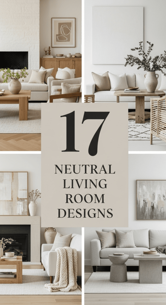
17 Neutral Living Room Designs: The Art of Subtle Sophistication
Neutral living room designs are far from boring; they are a masterclass in texture, light, and “visual breathing room.” By stripping away bold colors, the focus shifts to the quality of materials—the grain of the wood, the weave of the linen, and the coolness of the stone. A neutral palette (think oatmeal, greige, sand, and pewter) creates a timeless sanctuary that feels perpetually calm. Here are 17 designs that prove a muted palette can have maximum impact.
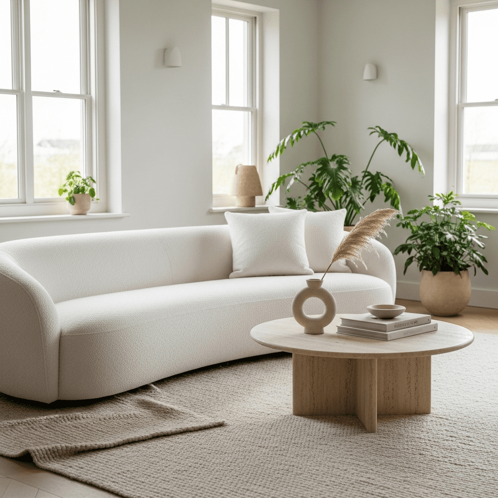
1. The Creamy “Bouclé” Dream
Focusing on the trendy, nubby texture of bouclé fabric on a curved sofa. Against off-white walls, the texture provides all the visual interest needed without a drop of color.
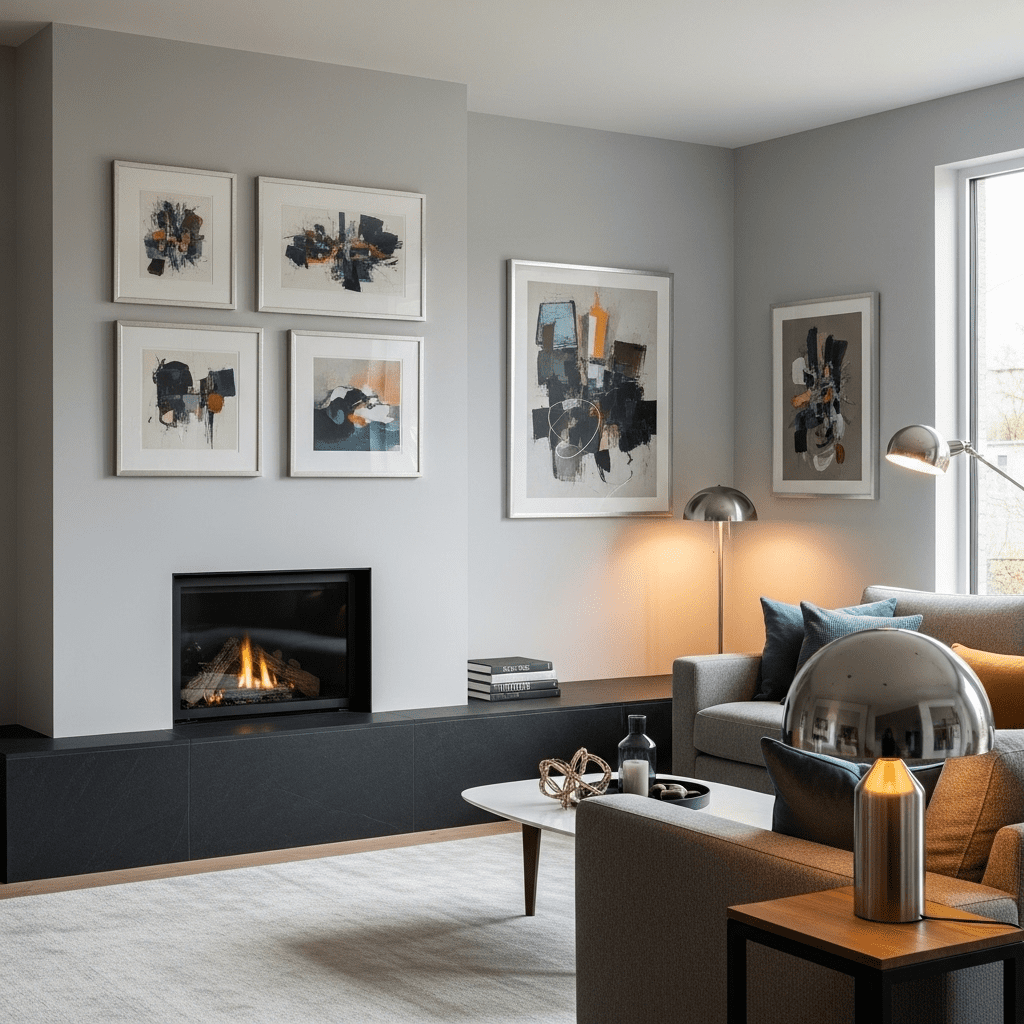
2. High-Contrast “Black & Bone”
Using a base of soft bone-white and punctuating it with sharp black lines—think black curtain rods, slim picture frames, and a black metal floor lamp.
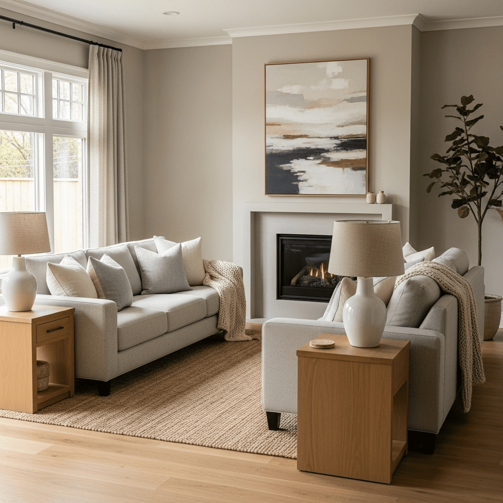
3. The “Greige” Transitional
A perfect middle ground between gray and beige. This design uses “greige” on the walls and upholstery to create a warm, modern space that works in any lighting.
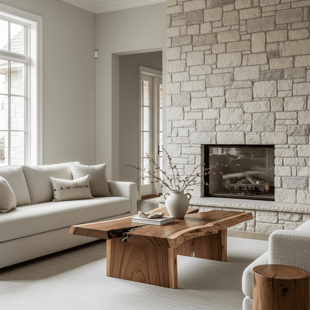
4. Raw Wood & Stone Organic
Celebrating the “unfinished” look. Pair a light-colored stone fireplace with a raw-edge oak coffee table and unbleached cotton pillows.
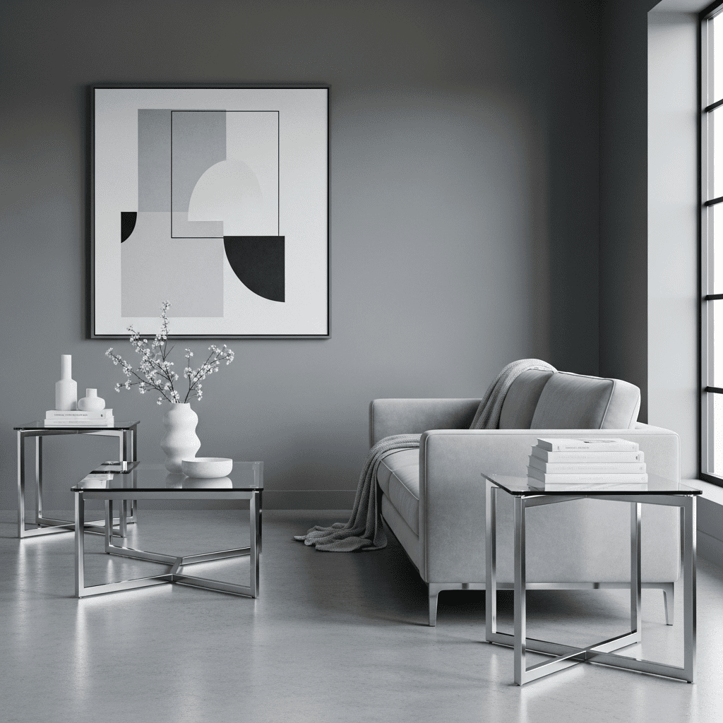
5. The “Pewter” Minimalist
A cooler neutral approach using various shades of pale gray and pewter. Metallic silver accents keep the room feeling crisp and clean.
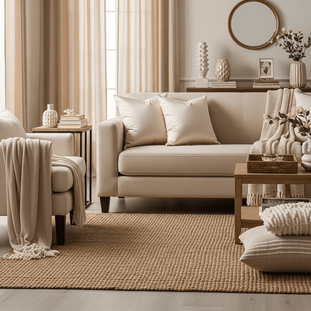
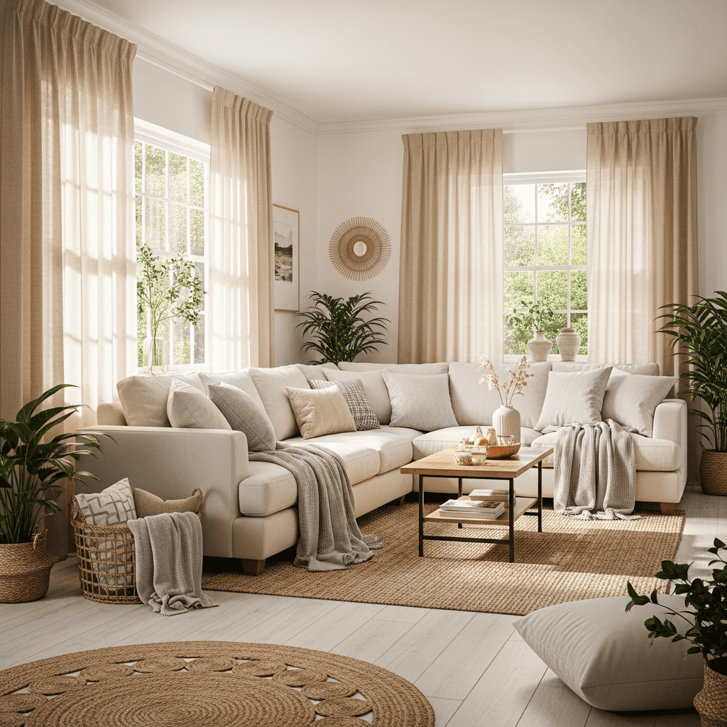
6. Layered Beige Tone-on-Tone
Using at least five different shades of beige in one room. The key is varying the materials: a jute rug, linen curtains, a velvet sofa, and a silk throw.
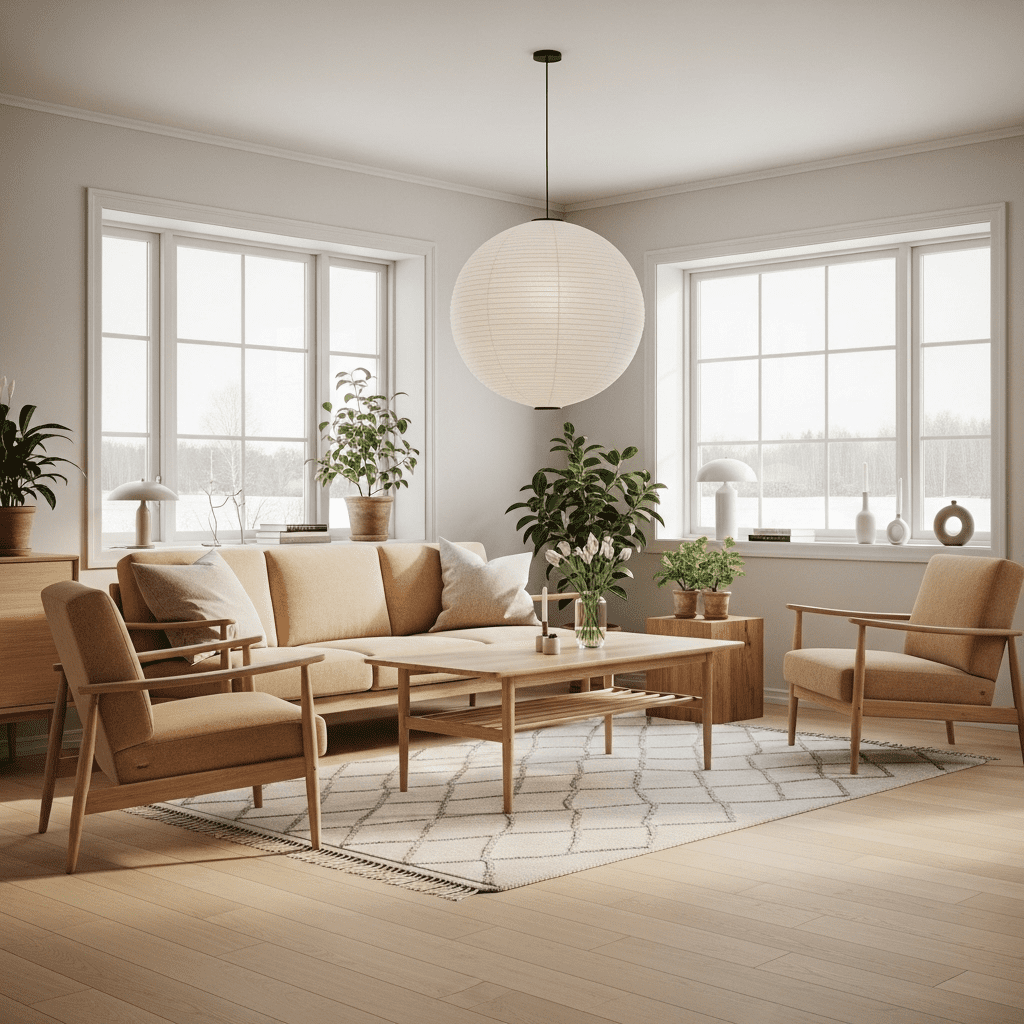
7. The “Scandi-Sand” Retreat
Inspired by Baltic coastlines, this design uses very pale wood (birch or ash) and “sand” colored upholstery with a focus on natural light.
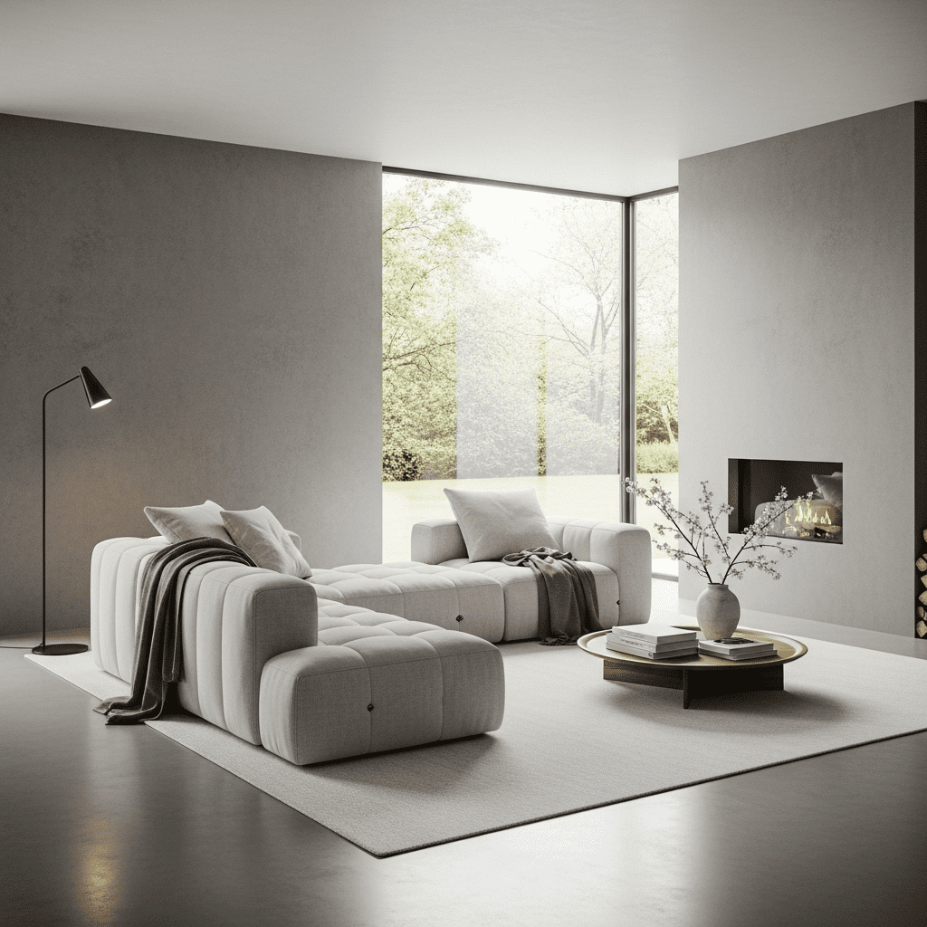
8. Concrete & Cashmere
A mix of industrial and luxury. Smooth gray concrete floors or walls balanced by the extreme softness of cashmere throws and plush rugs.
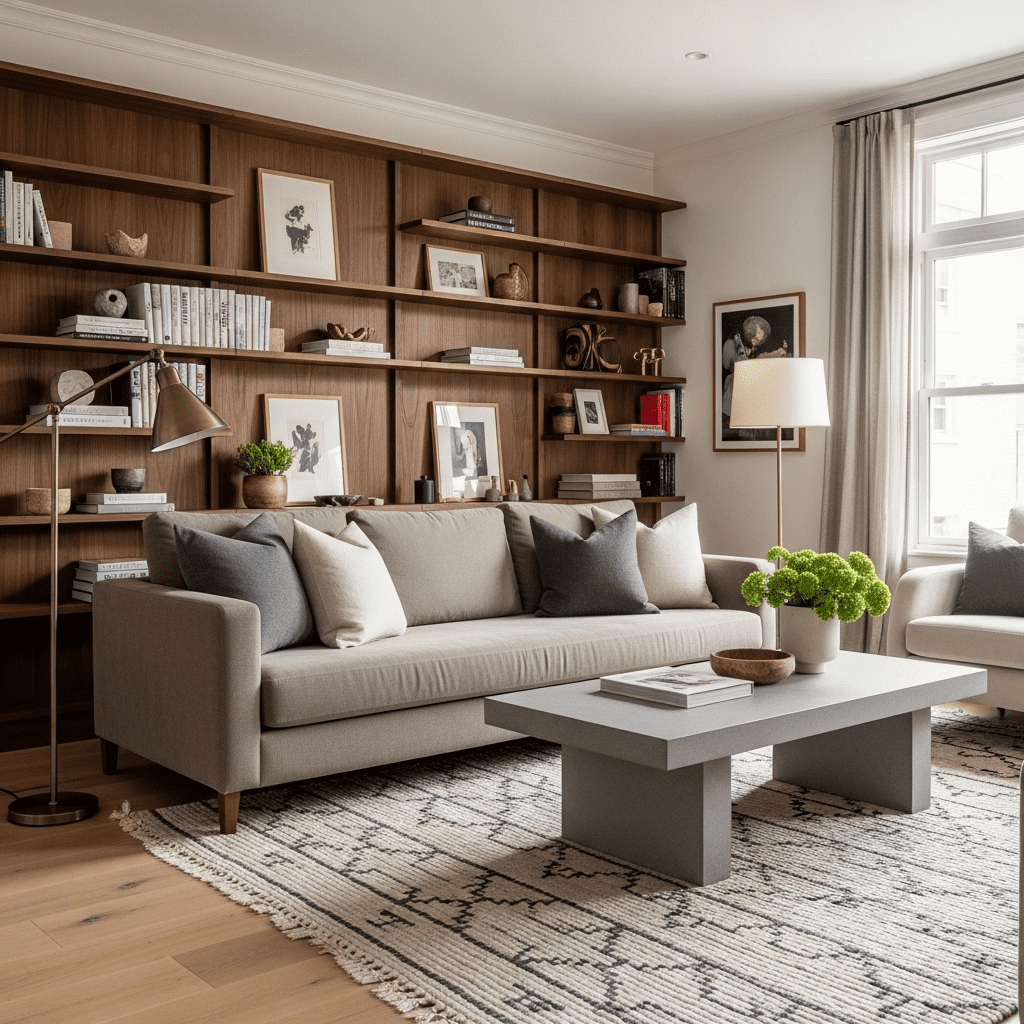
9. Warm Walnut & Taupe
Using the deep warmth of walnut wood to ground a room filled with light taupe fabrics. It feels sophisticated, masculine, and timeless.
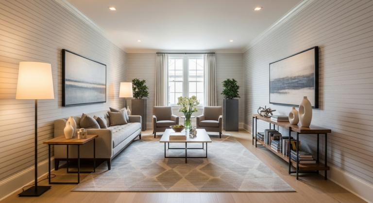
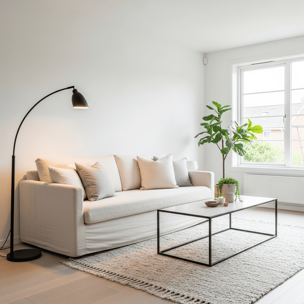
10. The “Swiss Coffee” Brightness
Using a warm, creamy white paint (like the famous Swiss Coffee shade) on walls and trim to create a soft, glowing environment that isn’t stark.
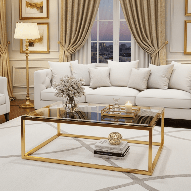
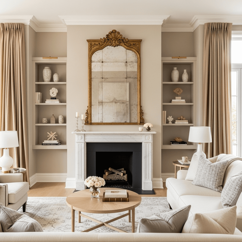
11. Antique Gold & Champagne
A more formal neutral look using “champagne” silks and satins paired with antiqued gold mirror frames and hardware.
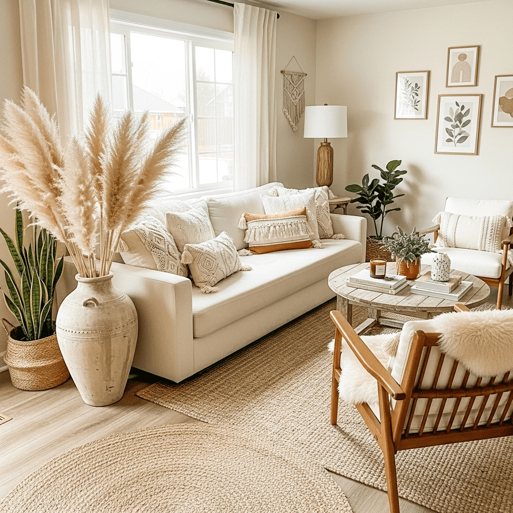
12. The Desert Boho Neutral
A Bohemian look without the vibrant colors. It relies on pampas grass, macramé, and rattan in shades of straw, tan, and cream.
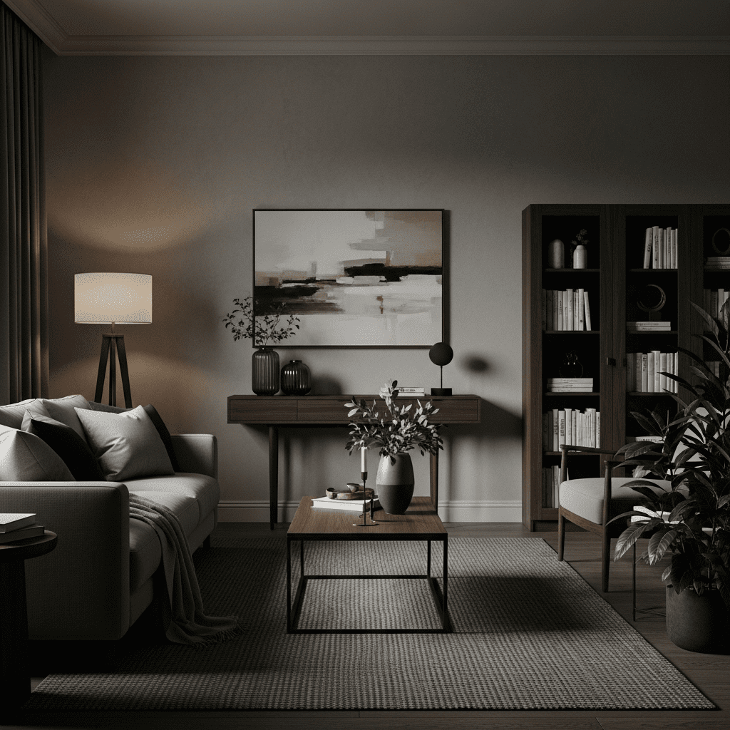
13. Smoky Quartz & Ash
A darker neutral palette that uses “smoky” brownish-grays. It feels intimate and expensive, especially when paired with soft spotlighting.
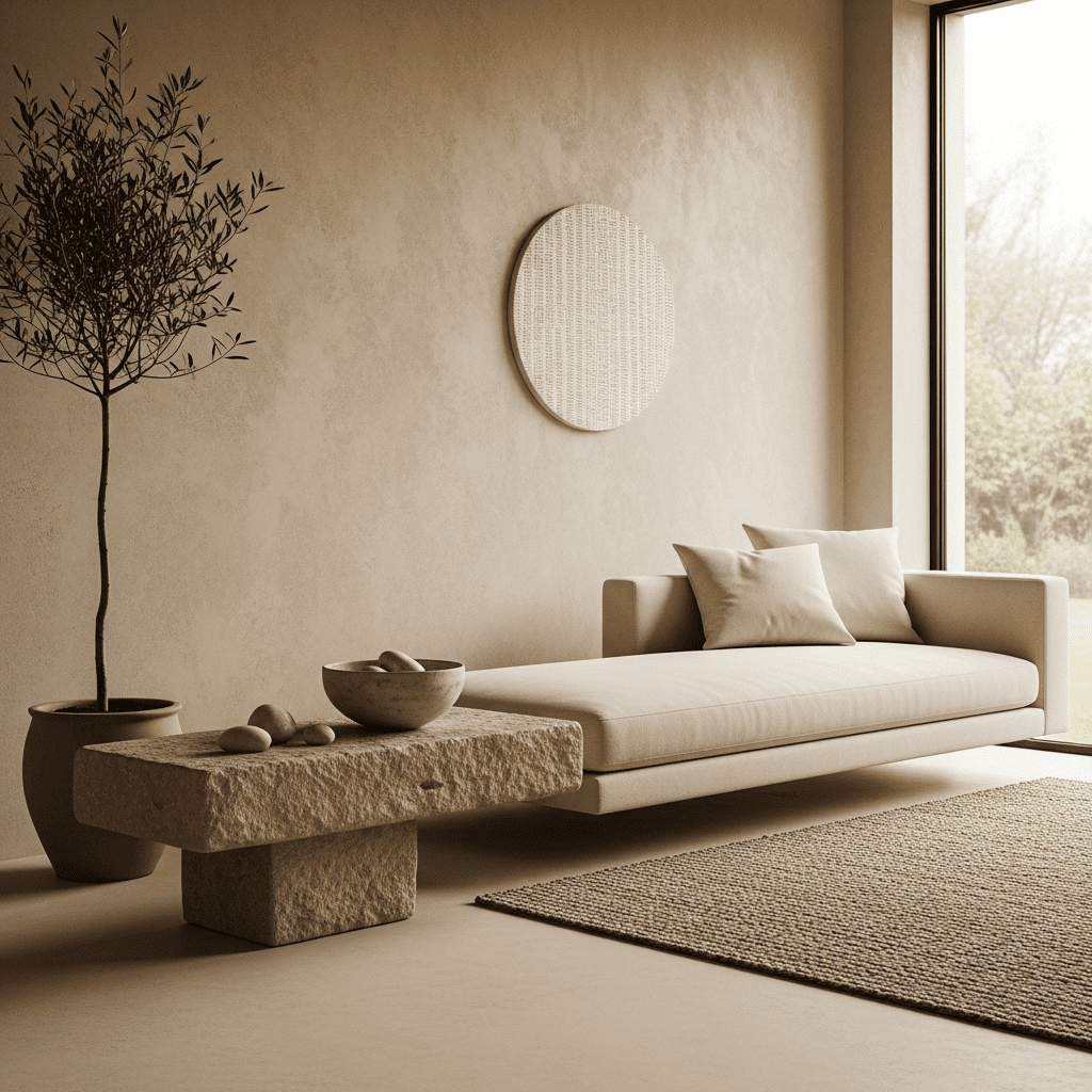
14. Plaster-Effect Serenity
Utilizing limewash or plaster finishes on the walls to create a soft, mottled texture that replaces the need for wallpaper or art.
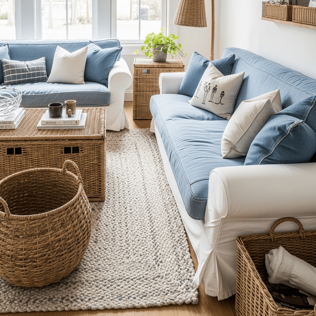
15. The “White Denim” Family Room
A practical neutral design using durable white or off-white denim slipcovers that can be easily washed, paired with sturdy woven baskets.
16. Architectural Slate & Silver
Focusing on the cool, dark gray of slate as an accent against light gray walls, with polished silver or nickel hardware.
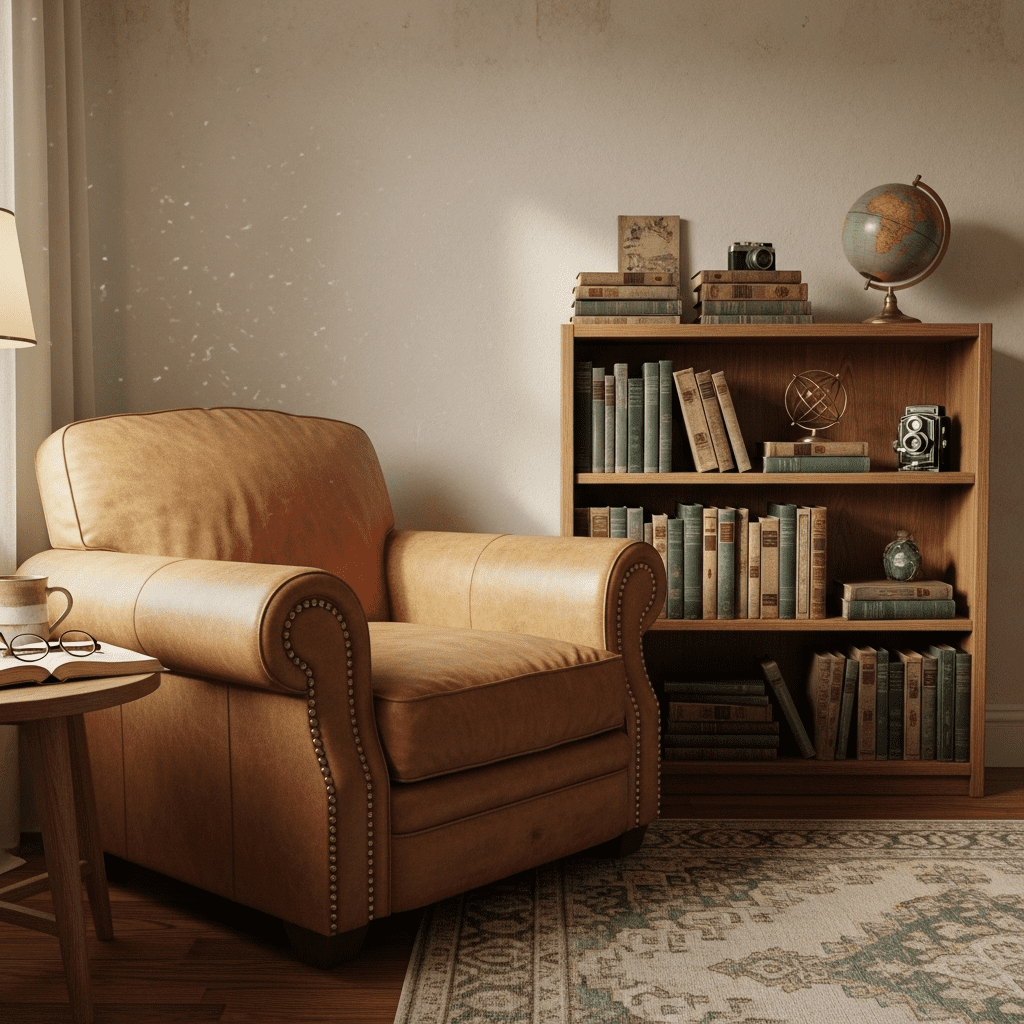
17. The “Vellum” Vintage Neutral
Inspired by old books and parchment. This look uses yellowish-creams, vintage “found” wooden objects, and worn leather in a tan shade.
Conclusion
Neutral living rooms are successful because they allow the inhabitants to be the most colorful part of the room. By focusing on a “tonal” approach—mixing different shades and textures within the same color family—you create a space that feels rich and interesting without being overwhelming. The key is to always include a touch of nature, like wood or stone, to keep the space feeling grounded and warm.