Guest bedroom color scheme: 18 palettes to set the perfect mood
Guest bedroom color scheme choices define the entire atmosphere of your home’s hospitality. When selecting a guest bedroom color scheme, you are balancing personal style with universal comfort, aiming for a palette that feels curated yet remains peaceful for any visitor. Whether you prefer the grounding effects of earthy neutrals or the sophisticated drama of deep jewel tones, these eighteen color stories offer a roadmap to creating a visually stunning and restful retreat.
See also: 7 Eclectic Long Narrow Living Room Ideas
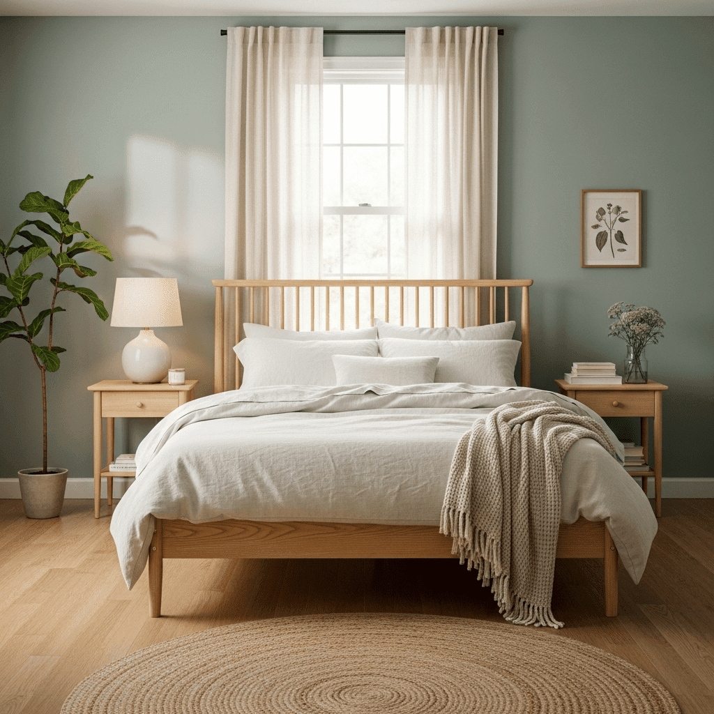
1. Sage Green and Warm Oak
This organic pairing mimics the natural world, offering a grounding and restorative vibe. The coolness of the sage is perfectly balanced by the honey-toned warmth of natural wood furniture.
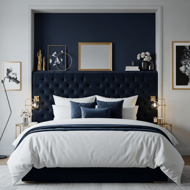
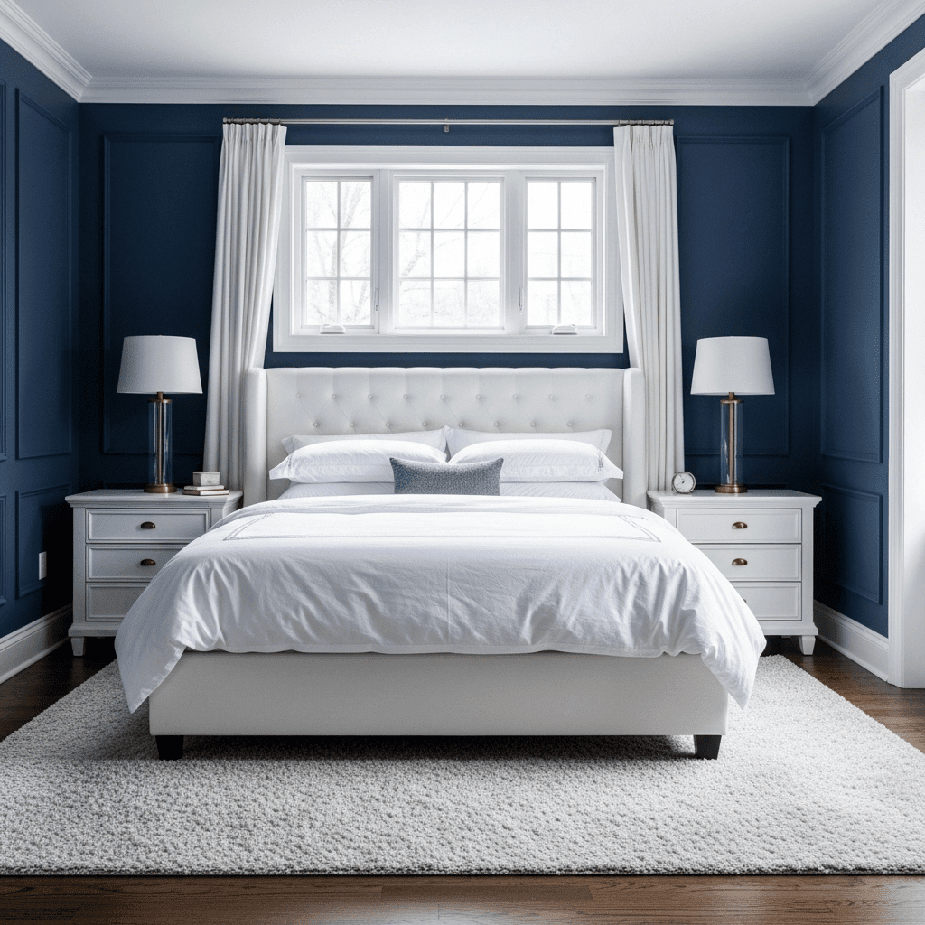
2. Navy Blue and Crisp White
A timeless, high-contrast palette that feels clean and structured. It evokes a nautical or “Hamptons” aesthetic that is universally liked and always looks polished.
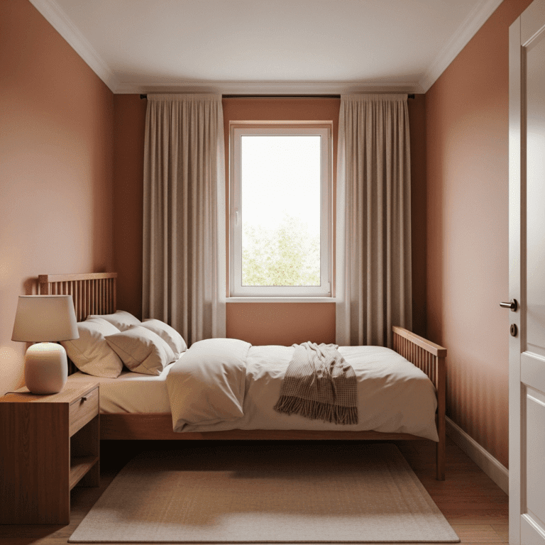
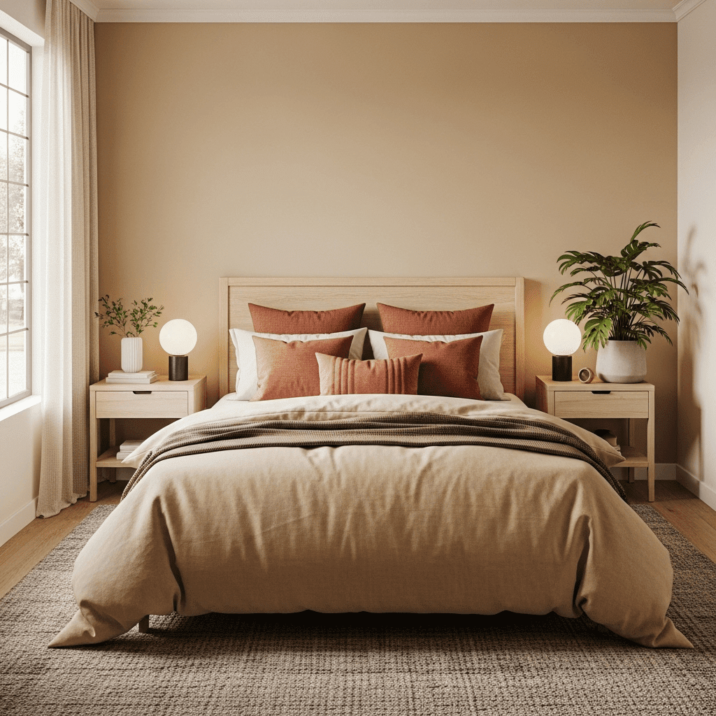
3. Terracotta and Sand
Inspired by desert landscapes, this warm scheme feels sun-drenched and cozy. It’s an inviting choice for rooms that don’t get much natural light, as the colors provide a built-in “glow.”
See also: 8 Long Narrow Living Room With Entry Way Layout
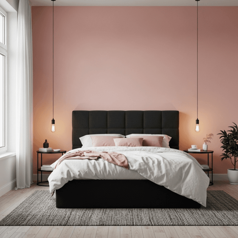
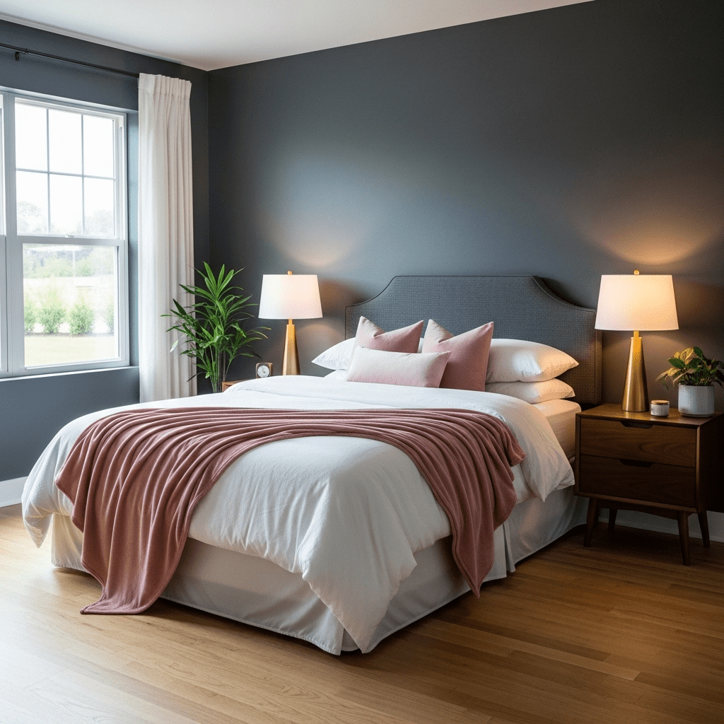
4. Charcoal Grey and Blush Pink
Blush pink softens the industrial edge of charcoal grey. This “moody yet soft” combination is sophisticated and works exceptionally well with metallic gold accents.
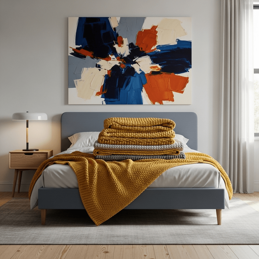
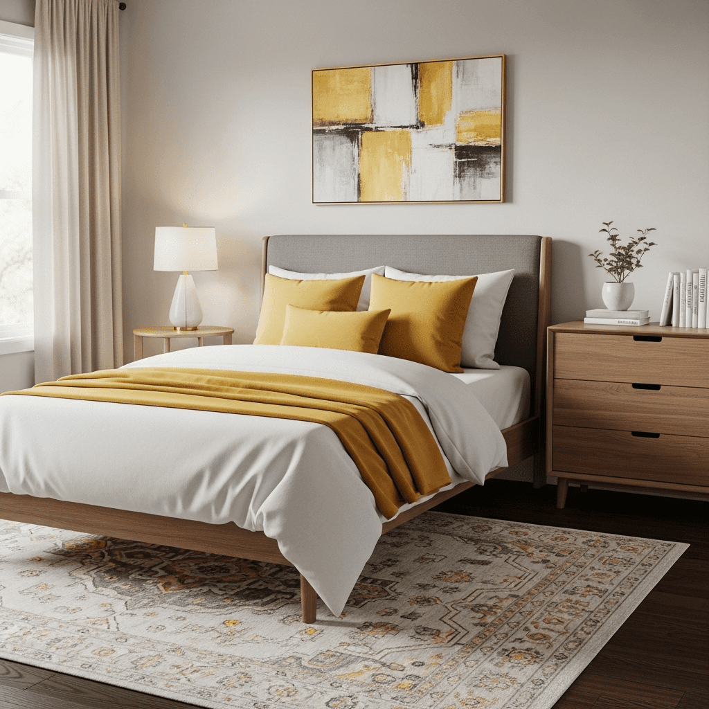
5. Mustard Yellow and Slate
Slate grey provides a cool, neutral backdrop that allows pops of mustard yellow to shine. It’s a modern, mid-century inspired look that feels energetic and optimistic.
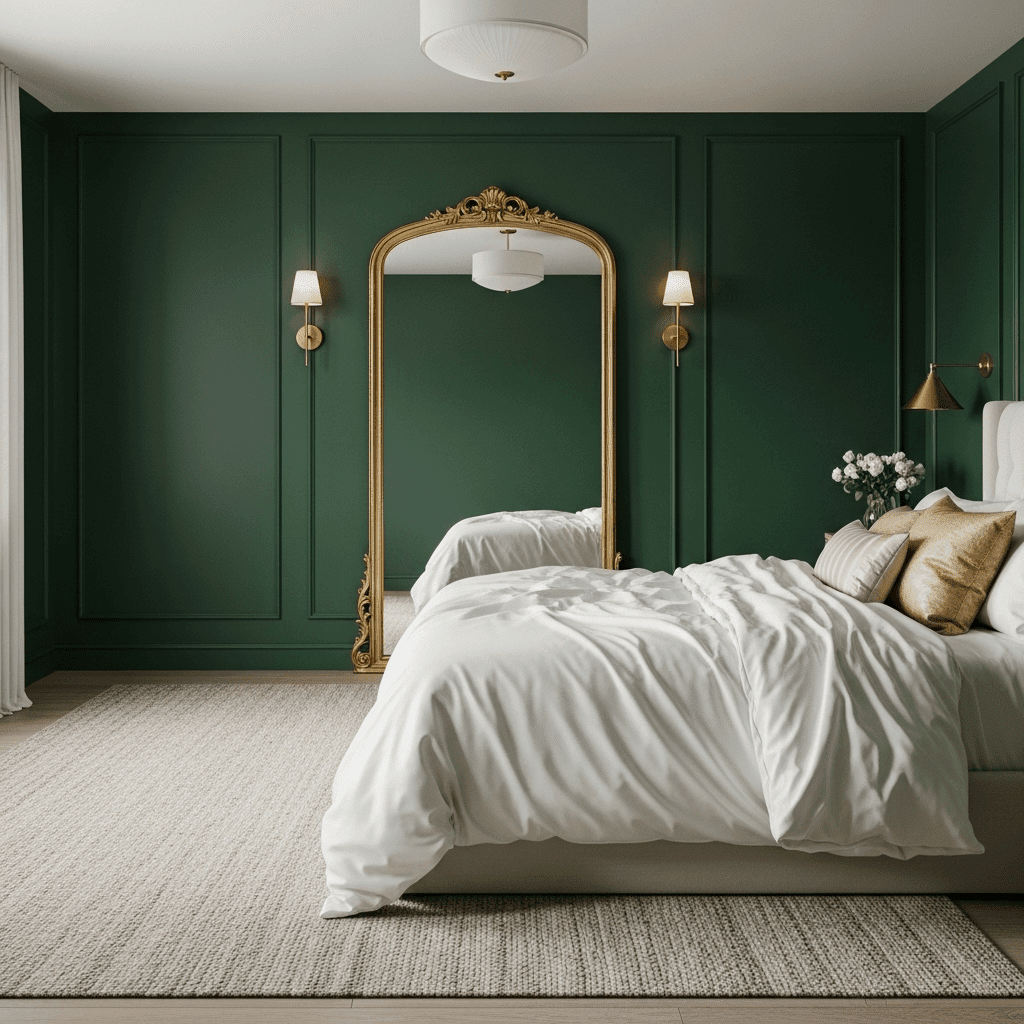
6. Emerald Green and Gold
For a guest room that feels like a boutique hotel, emerald green walls paired with gold hardware offer a sense of vintage luxury and drama.
7. Lavender and Dove Grey
Lavender is a more grown-up version of purple that carries the same calming properties as blue. Paired with dove grey, it feels airy, light, and incredibly peaceful.
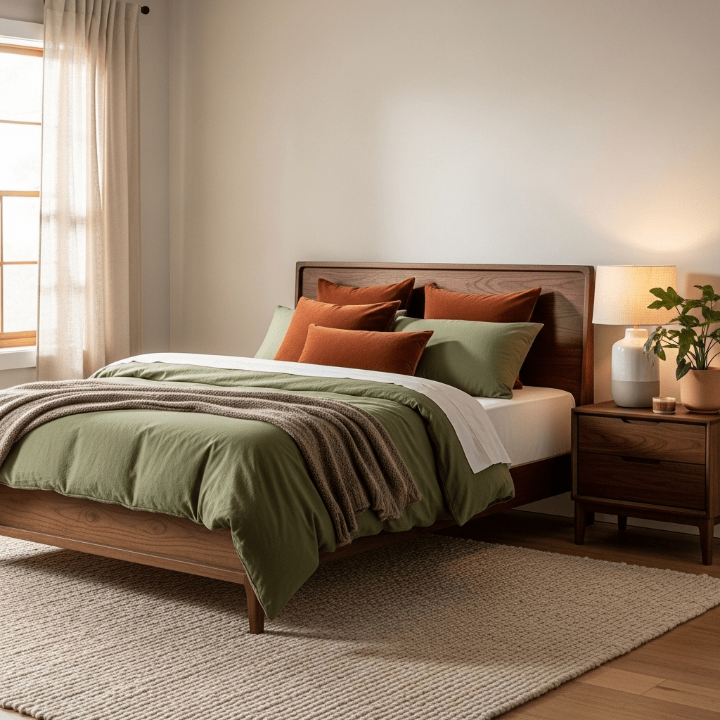
8. Olive Green and Rust
This mid-century earthy palette is rich and storied. It feels particularly “hygge” in the winter months, providing a sense of warmth and heritage.
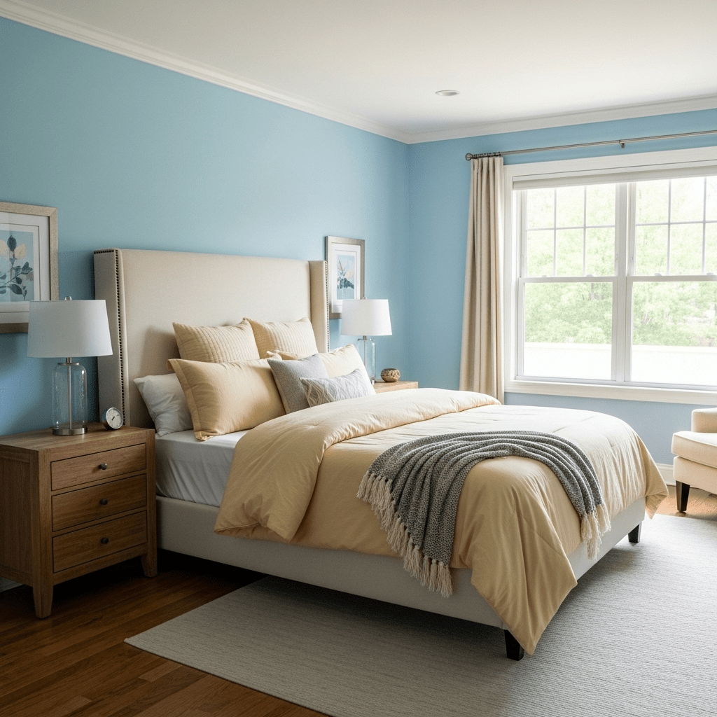
9. Sky Blue and Buttercream
A soft, traditional palette that feels like a clear spring morning. It’s a gentle, low-energy scheme that encourages long mornings and lazy naps.
10. Black, White, and Camel
A “fashion-forward” trio that relies on the warmth of camel leather to keep the black-and-white base from feeling too cold or clinical.
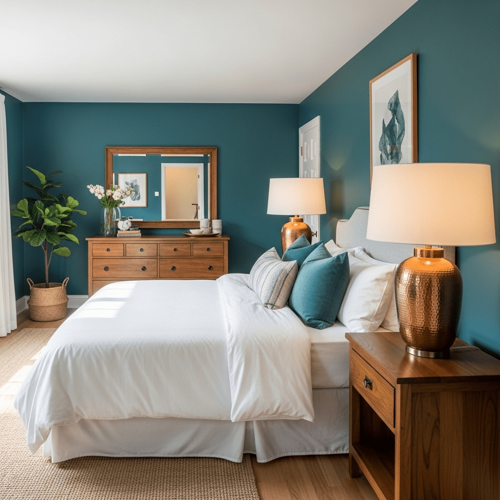
11. Teal and Copper
Teal sits between blue and green, offering a saturated but calming look. Copper accents provide a metallic warmth that makes the teal feel even richer.
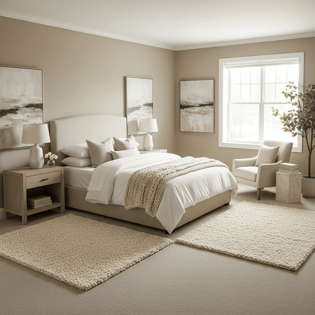
12. Greige and Ivory
For the ultimate minimalist, “greige” (a mix of grey and beige) provides a sophisticated neutral that changes with the light. Ivory layers keep it feeling fresh.
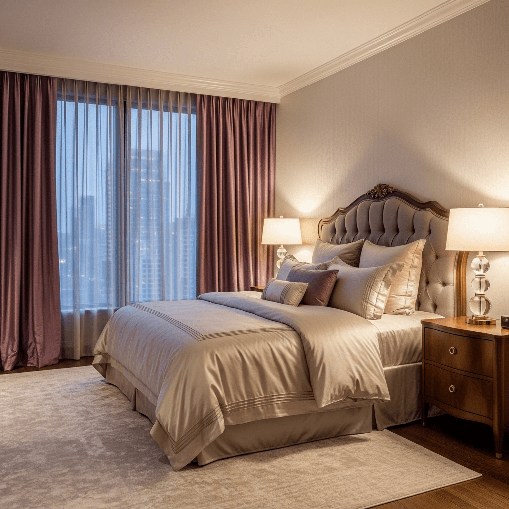
13. Plum and Champagne
A royal, feminine palette that feels luxurious and intimate. Champagne-colored silks provide a shimmering contrast to the matte depth of plum walls.
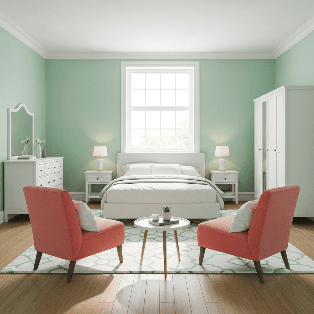
14. Mint and Coral
A playful, “Palm Springs” inspired palette. It’s high-energy and fun, making it perfect for a guest room meant for family vacations or summer stays.
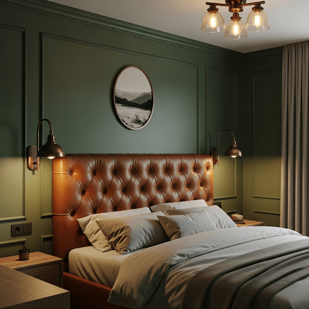
15. Forest Green and Cognac
This combination feels like a classic library or a mountain lodge. The deep green is masculine and sturdy, while cognac leather adds a touch of refined comfort.
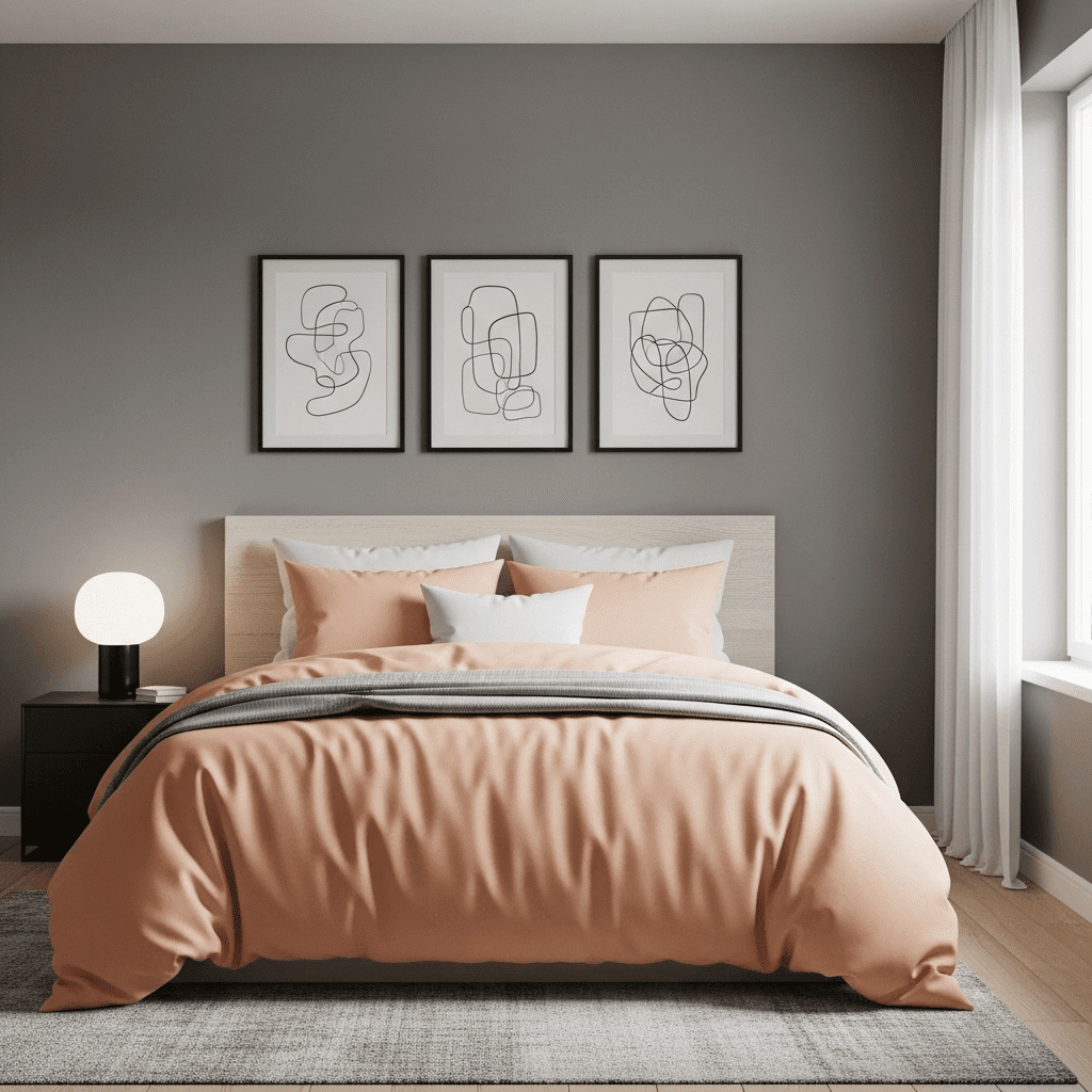
16. Peach and Pewter
Peach offers a softer, warmer alternative to pink, while pewter grey adds a metallic, modern edge that keeps the room feeling contemporary.
17. Ochre and Espresso
Deep espresso wood tones ground the vibrant, earthy energy of ochre yellow. It’s a bold, sophisticated look that feels culturally rich and warm.
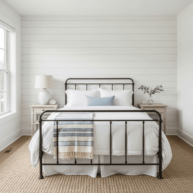
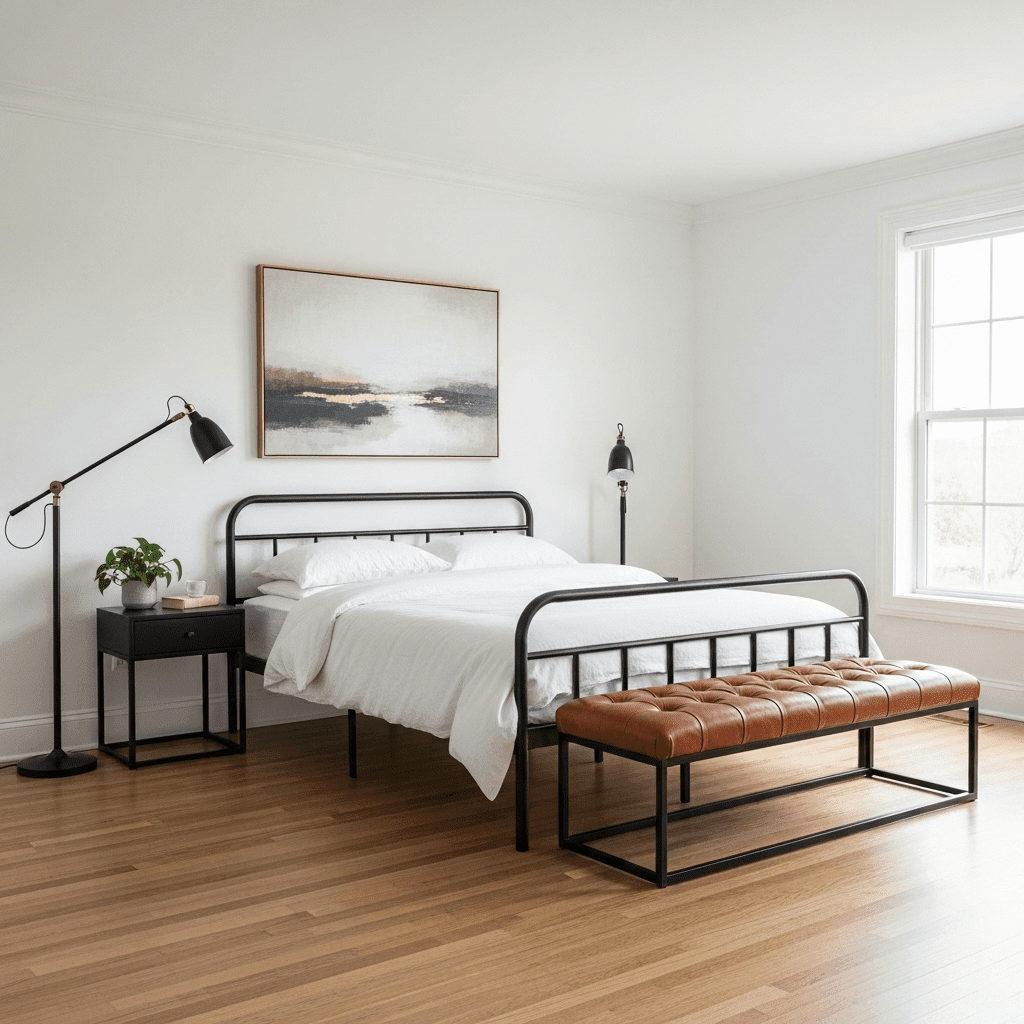
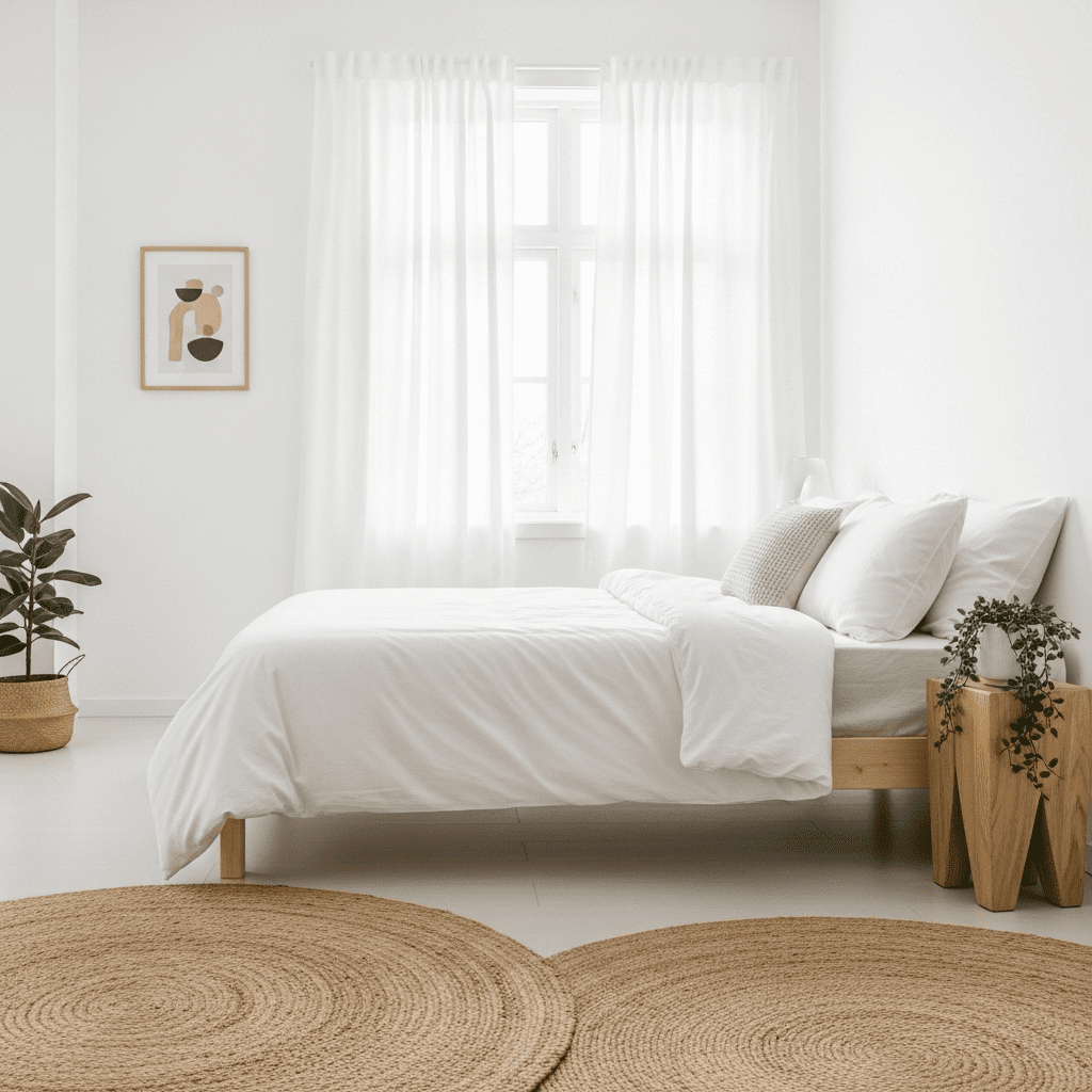
18. All-White with Natural Textures
Technically a “no-color” scheme, this relies on the play of light and shadow on white surfaces. Texture—like jute, linen, and wool—becomes the substitute for color.
Conclusion
Selecting from these 18 guest bedroom color schemes allows you to tailor the psychological impact of your home’s most important room. Whether you want your guests to feel energized by a pop of mustard or lulled to sleep by a wash of sage, the right color palette is the most powerful design tool at your disposal. By layering your chosen hues through paint, textiles, and art, you create a cohesive sanctuary that speaks to your unique sense of hospitality.