 Skip to content
 A circulation diagram is a diagram that shows how people move through a building or site. Unlike a floor plan, which shows walls and rooms, a circulation diagram shows paths, direction, flow, and nodes. Circulation is the movement of people — entering, exiting, walking, waiting, turning, gathering. A good circulation diagram makes movement visible.
These 12 circulation diagram architecture ideas span buildings, sites, and urban plans. Each idea includes defining characteristics, graphic strategies, and design principles.
1. The Arrow Flow Diagram
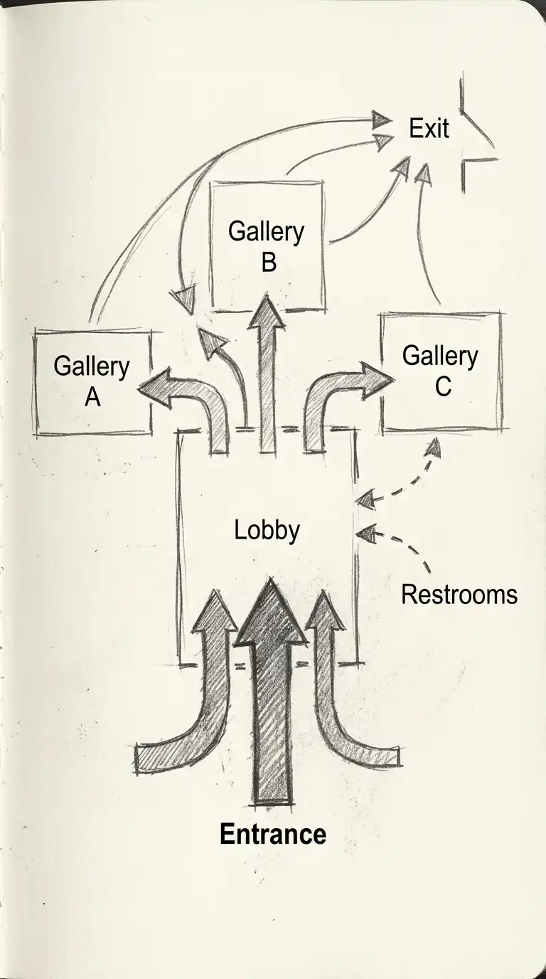
The arrow flow diagram uses arrows to show the direction of movement. Thick arrows show heavy traffic. Thin arrows show light traffic. Dashed arrows show occasional or secondary movement. The arrow flow diagram is simple, clear, and directional.
This diagram is ideal for showing circulation in buildings, airports, and train stations. The emotional effect is directional, flow-oriented, and clear.
Quick Tips
- Arrow thickness must indicate traffic volume.
- Arrows must show direction (one-way or two-way).
- Dashed arrows indicate occasional movement.
2. The Path and Node Diagram
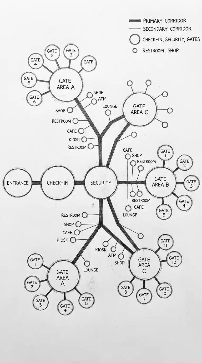
The path and node diagram shows circulation as a network of paths and nodes. Paths are lines of movement. Nodes are intersections, entrances, elevators, stairs, and gathering spaces. The path and node diagram is ideal for complex buildings.
This diagram is ideal for hospitals, airports, and convention centres. The emotional effect is networked, nodal, and complex.
Quick Tips
- Paths are lines (thick for primary, thin for secondary).
- Nodes are circles (large for major nodes, small for minor nodes).
- Paths must connect nodes.
3. The Circulation Zone Diagram
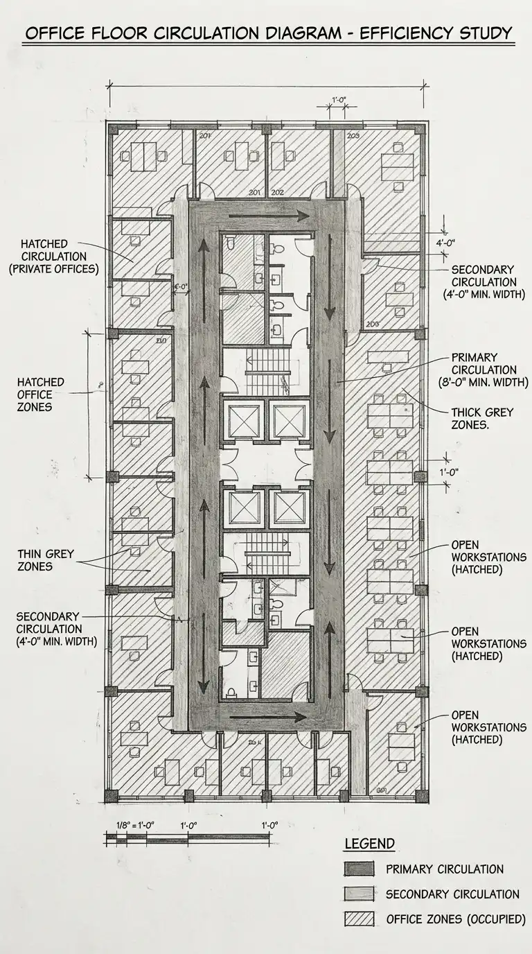
The circulation zone diagram shows the space dedicated to movement separate from occupied space. Primary circulation (main corridors, stairs) is one zone. Secondary circulation (hallways, ramps) is another zone. Occupied zones (rooms, offices) are separate. The circulation zone diagram is ideal for efficiency studies.
This diagram is ideal for offices, schools, and apartment buildings. The emotional effect is zoned, efficient, and separated.
Quick Tips
- Primary circulation = thick zones (e.g., 2.4 metres wide).
- Secondary circulation = thin zones (e.g., 1.5 metres wide).
- Occupied zones = hatched or coloured areas.
4. The Vertical Circulation Diagram
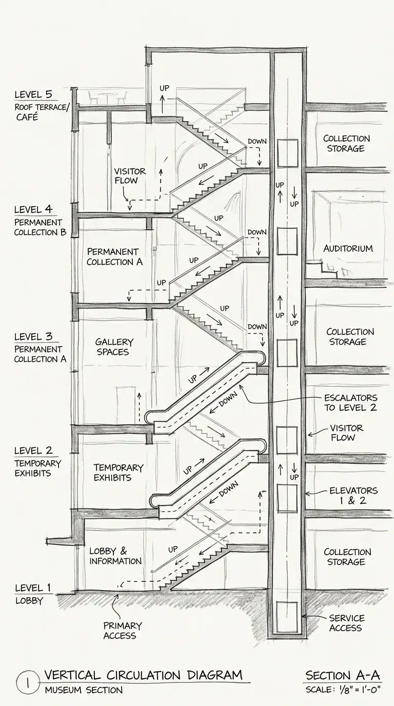
The vertical circulation diagram shows movement between floors. The diagram is a section or an axonometric. Stairs, elevators, escalators, and ramps are shown. Arrows show direction (up and down). The vertical circulation diagram is ideal for multi-storey buildings.
This diagram is ideal for skyscrapers, hospitals, and museums. The emotional effect is vertical, sectional, and connecting.
Quick Tips
- Stairs are diagonal lines.
- Elevators are vertical rectangles.
- Arrows show direction (up and down).
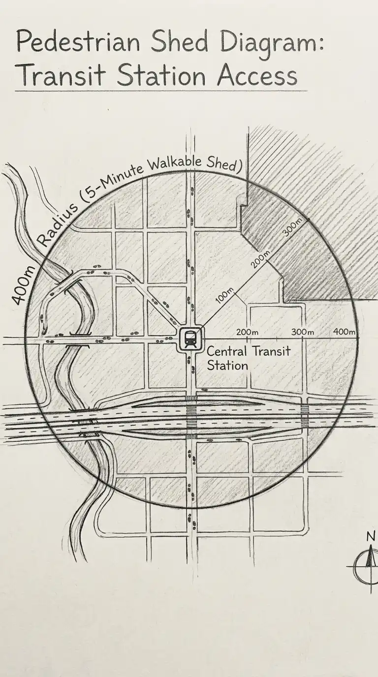
5. The Pedestrian Shed Diagram
The pedestrian shed diagram shows the area that can be reached by walking a certain distance from a point. The most common distance is 5 minutes (400 metres). The diagram is a circle or irregular polygon around a transit stop or building entrance. The pedestrian shed diagram is ideal for transit-oriented development.
This diagram is ideal for urban planning and site analysis. The emotional effect is walkable, reachable, and shed-like.
Quick Tips
- The centre is the transit stop or building entrance.
- The radius is 400 metres (5-minute walk).
- The shape is a circle or adjusted for barriers (rivers, highways).
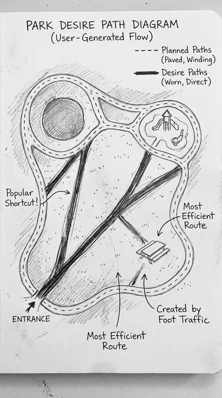
6. The Desire Path Diagram
The desire path diagram shows where people actually walk, not where the architect planned. Desire paths are worn into grass or snow. They show the shortest, most convenient route. The desire path diagram is ideal for site planning and landscape architecture.
This diagram is ideal for parks, campuses, and public plazas. The emotional effect is desirous, worn, and user-generated.
Quick Tips
- Planned paths are dashed lines.
- Desire paths are solid lines worn into the ground.
- Desire paths are often diagonal, cutting corners.
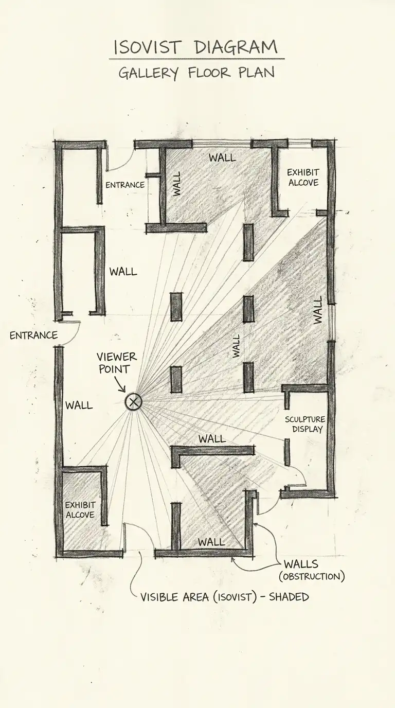
7. The Isovist Diagram
The isovist diagram shows what is visible from a point. The isovist is the area of space visible without moving. The isovist diagram is ideal for studying visibility, surveillance, and wayfinding.
This diagram is ideal for museums, galleries, and security studies. The emotional effect is visible, viewable, and isovist.
Quick Tips
- The point is the viewer’s eye.
- The isovist is the visible area.
- Walls and columns block the isovist.
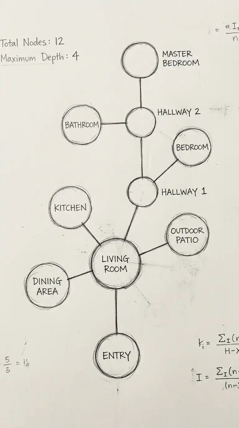
8. The Space Syntax Diagram
The space syntax diagram shows the connectivity of spaces. Spaces are circles. Connections are lines between circles. The diagram shows which spaces are integrated and which are segregated. The space syntax diagram is ideal for analysing social spaces.
This diagram is ideal for housing, offices, and urban plans. The emotional effect is syntactic, connected, and analytical.
Quick Tips
- Spaces are circles (size = importance).
- Connections are lines between circles.
- Integrated spaces have many connections. Segregated spaces have few.
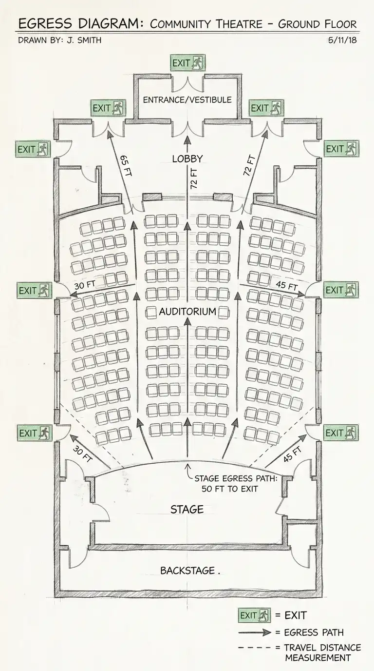
9. The Egress Diagram
The egress diagram shows emergency exit routes. The diagram shows the shortest path from any point to an exit. The diagram is required for building codes and safety plans. The egress diagram is ideal for fire safety and accessibility.
This diagram is ideal for all public buildings. The emotional effect is egress, safe, and code-compliant.
Quick Tips
- Exits are marked with green exit signs.
- Paths are arrows from any point to the nearest exit.
- Travel distance must be shown.
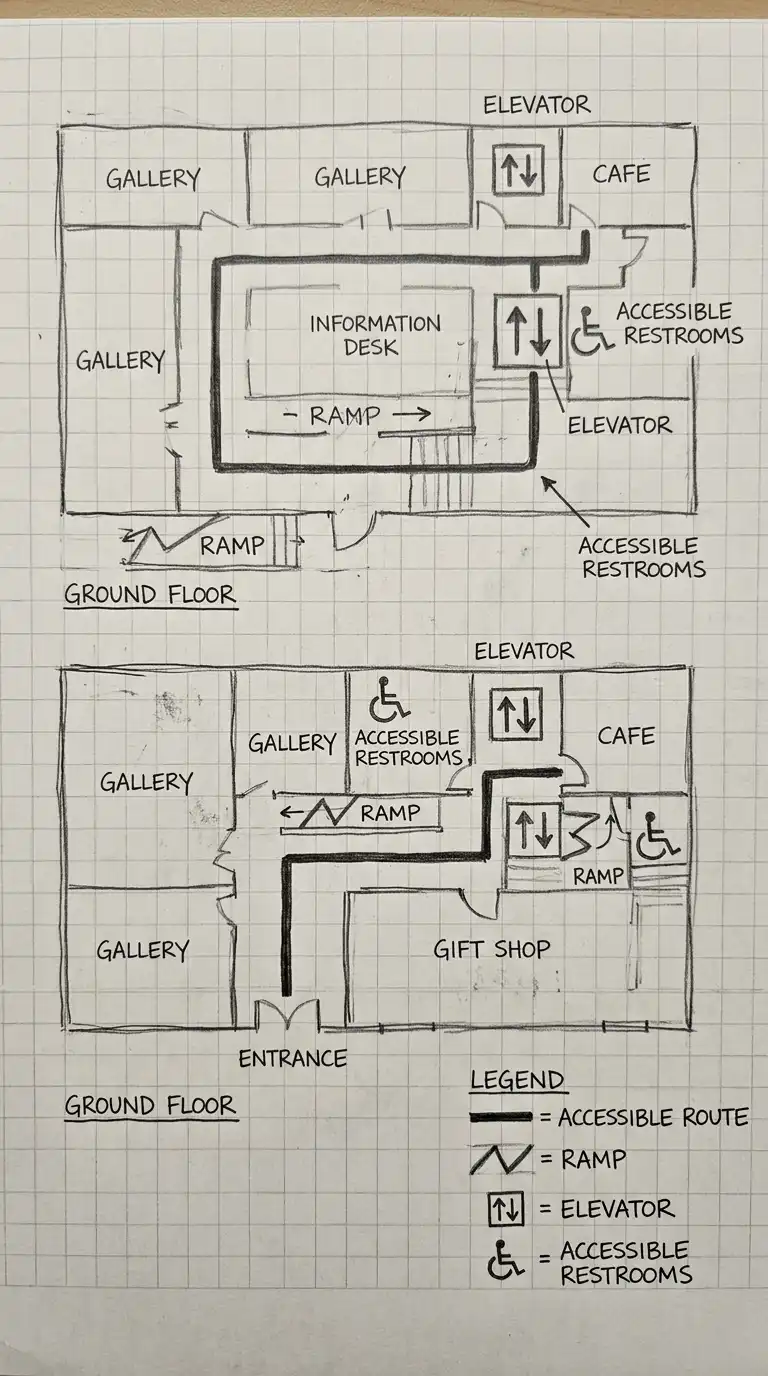
10. The Accessibility Diagram
The accessibility diagram shows accessible routes for wheelchairs. The diagram shows ramps, elevators, wide doors, and accessible restrooms. The accessibility diagram is required for building codes and ADA compliance.
This diagram is ideal for all public buildings. The emotional effect is accessible, inclusive, and code-compliant.
Quick Tips
- Accessible routes are thick lines.
- Ramps are zigzag lines.
- Elevators are squares with arrows.
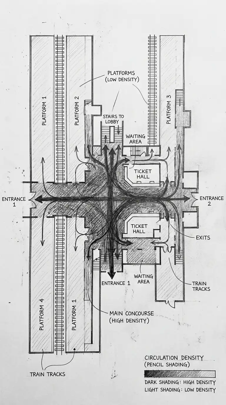
11. The Circulation Density Diagram
The circulation density diagram shows the number of people moving through each space. The diagram is a heat map of movement. Dark colours are high density. Light colours are low density. The circulation density diagram is ideal for studying congestion.
This diagram is ideal for stadiums, train stations, and convention centres. The emotional effect is dense, congested, and heat-mapped.
Quick Tips
- Dark colours = high density (crowded).
- Light colours = low density (empty).
- Density is people per square metre.
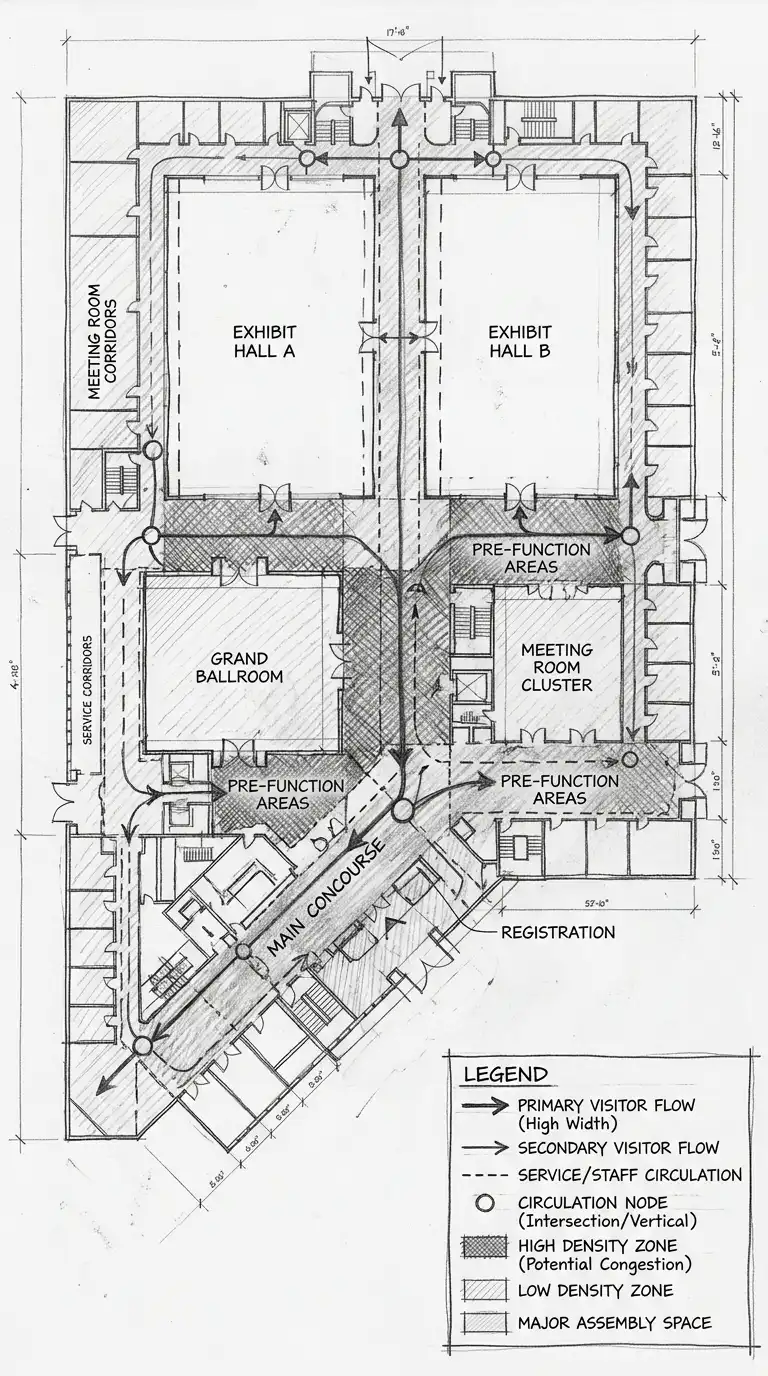
12. The Hybrid Circulation Diagram
The hybrid circulation diagram combines multiple diagram types. Arrows, paths, nodes, zones, and density are shown together. The hybrid diagram is complex and dense. It requires a clear legend. The hybrid circulation diagram is ideal for comprehensive analysis.
This diagram is ideal for complex buildings and master plans. The emotional effect is dense, complex, and synthesised.
Quick Tips
- Use a consistent colour and line code.
- Include a legend explaining every symbol.
- Keep the diagram readable — do not overload it.
Final Thoughts
These 12 circulation diagrams are not mutually exclusive. A path and node diagram can have arrows. A circulation zone diagram can show density. A hybrid diagram can combine arrows, paths, nodes, zones, and density. The best circulation diagrams are not the most beautiful — they are the most informative. They show how people move. They show where people gather. They show where people slow down, speed up, stop, and turn. They are not plans — they are maps of movement. They are the architecture of the invisible.
