 Skip to content
 A zoning diagram is an architectural diagram that shows how a site or building is divided into zones. Zones are areas with different functions, privacy levels, or environmental conditions. A zoning diagram is not a floor plan — it has no walls, no doors, no dimensions. It is a diagram of organisation. It answers the question: what goes where?
These 12 zoning architecture diagram ideas span site planning, building organisation, and interior layout. Each idea includes defining characteristics, graphic strategies, and applications.
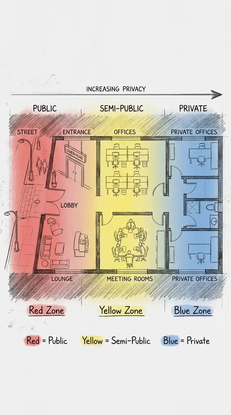
1. The Public-Private Gradient
The public-private gradient zones a site or building from most public to most private. Public zones are at the street edge. Private zones are at the rear. Semi-public zones are in between. The gradient is often linear, from front to back.
This diagram is ideal for houses, offices, and public buildings. The emotional effect is hierarchical, graduated, and privacy-conscious.
Quick Tips
- Use colour: red for public, yellow for semi-public, blue for private.
- Arrange zones linearly from public to private.
- The gradient should be continuous, not stepped.
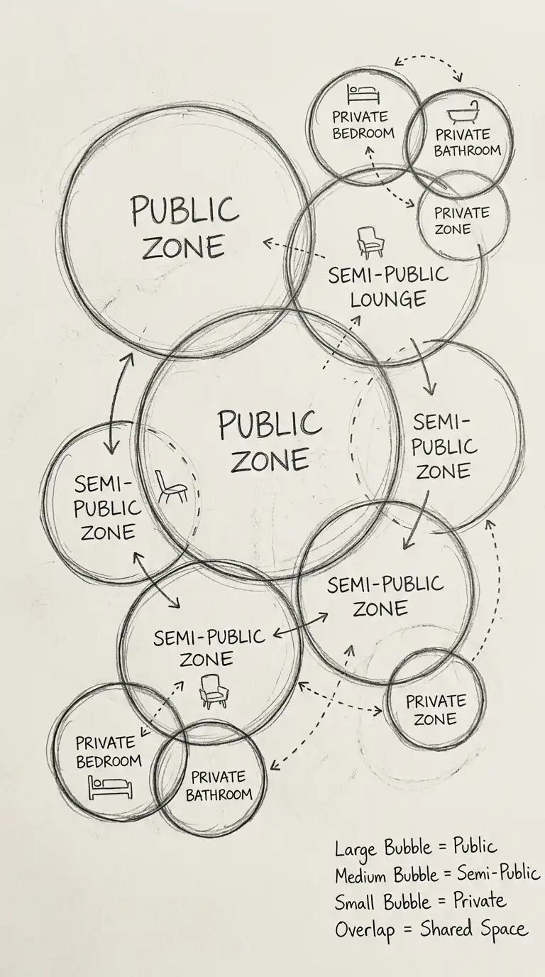
2. The Bubble Zoning Diagram
The bubble zoning diagram uses bubbles (circles) to represent zones. The size of the bubble represents the size of the zone. The proximity of bubbles represents adjacency requirements. Overlapping bubbles represent shared zones. The bubble diagram is abstract and flexible.
This diagram is ideal for early design exploration. The emotional effect is abstract, flexible, and programmatic.
Quick Tips
- Bubble size must be proportional to zone size.
- Bubble proximity must indicate adjacency requirements.
- Overlapping bubbles indicate shared zones.
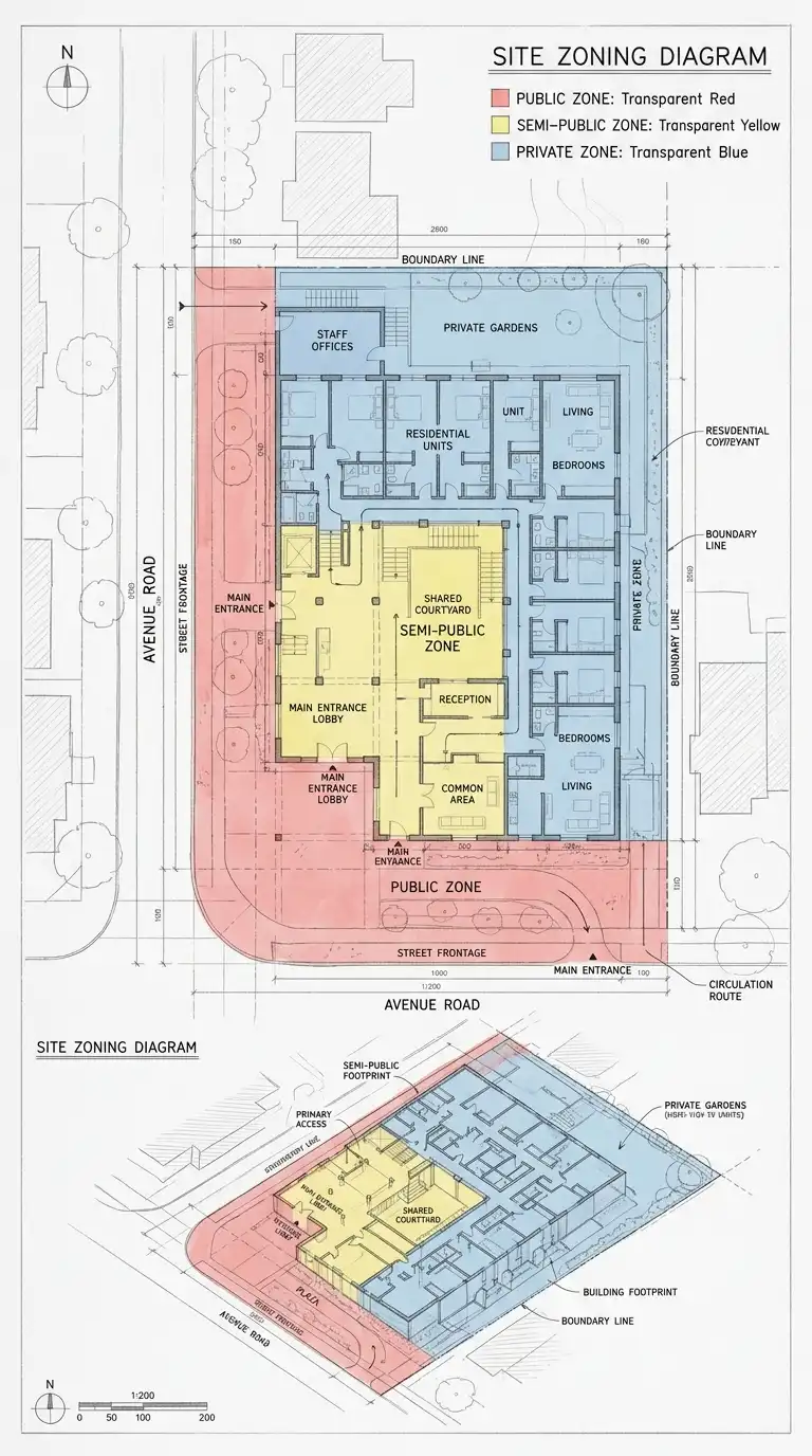
3. The Colour-Coded Plan
The colour-coded plan is a site plan or floor plan overlaid with colour to show zones. The underlying plan is faint. The colour is transparent. The colour-coded plan is specific and analytical. It shows where each zone is located.
This diagram is ideal for site analysis and building analysis. The emotional effect is analytical, specific, and layered.
Quick Tips
- The underlying plan must be faint (grey or light lines).
- The colour must be transparent (30-50% opacity).
- Use a consistent colour code across all drawings.
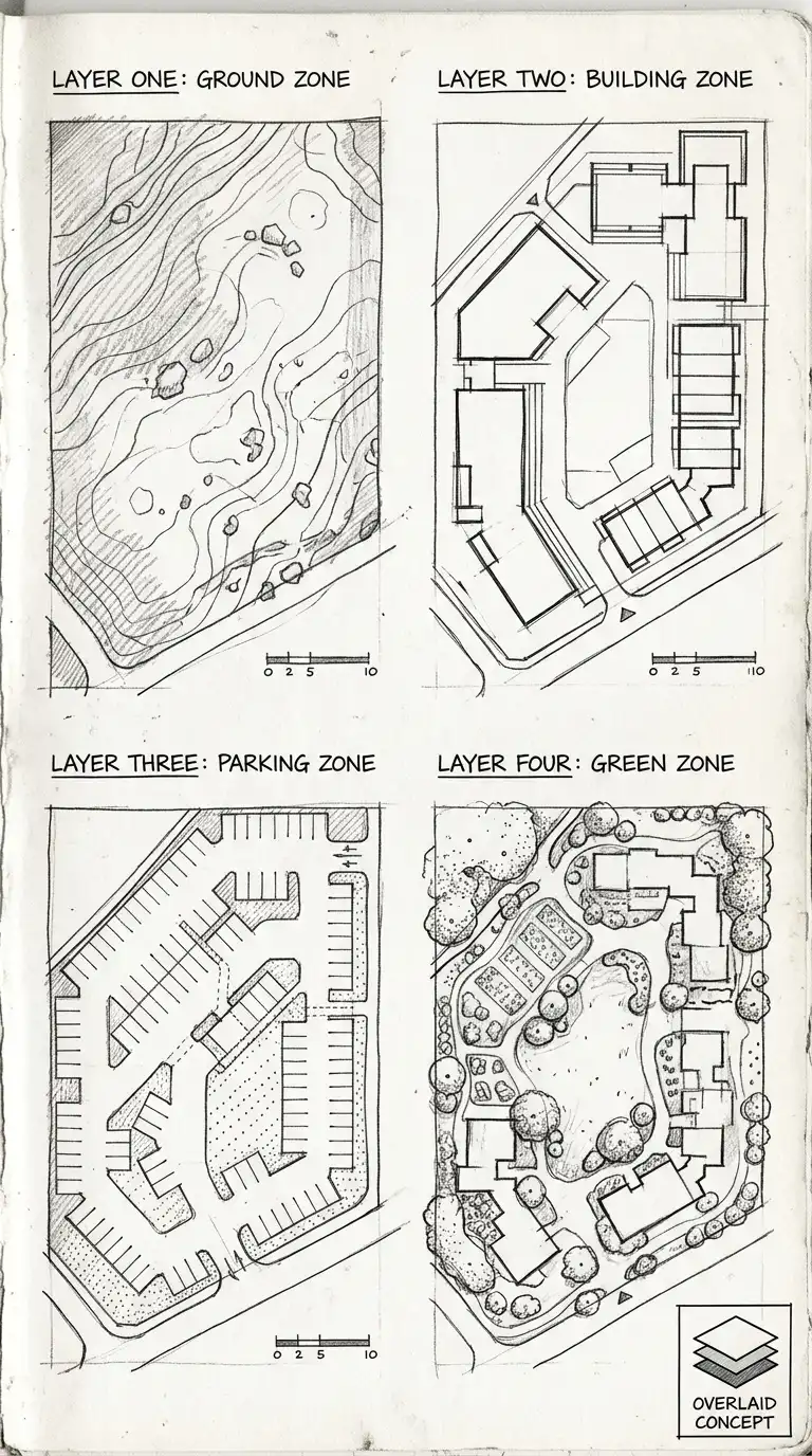
4. The Layer Diagram
The layer diagram separates zones into different layers. Each layer is a separate sheet or a separate colour. The layers can be overlaid to see the whole. The layer diagram is ideal for complex sites with multiple overlapping zones (e.g., ground zone, building zone, parking zone, green zone).
This diagram is ideal for complex urban sites and master plans. The emotional effect is layered, separable, and complex.
Quick Tips
- Each layer must be a separate sheet or colour.
- Layers can be viewed separately or overlaid.
- Label each layer clearly.
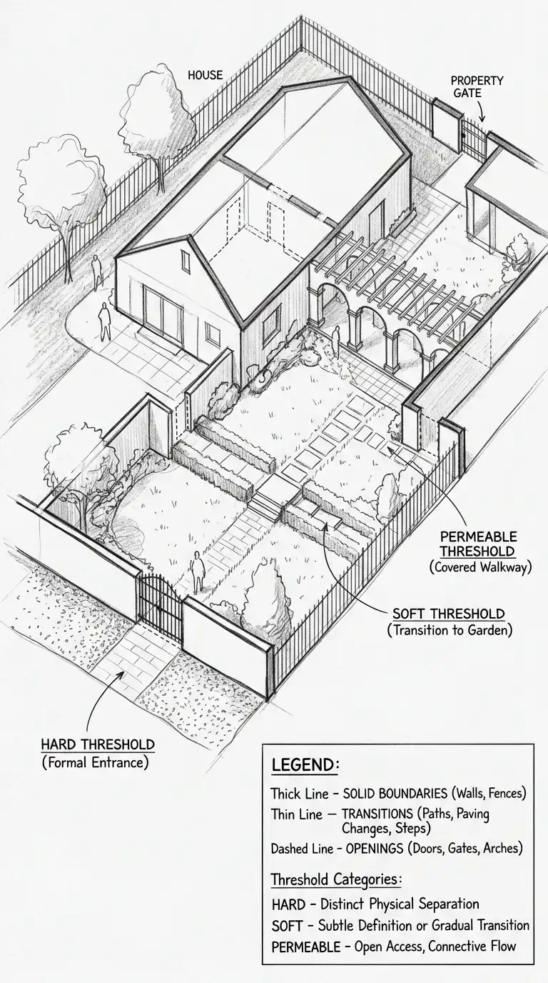
5. The Threshold Diagram
The threshold diagram shows the edges between zones. A thick line is a hard threshold (wall, fence, locked door). A thin line is a soft threshold (path, change in paving, change in lighting). A dashed line is a permeable threshold (gate, door, opening).
This diagram is ideal for security, privacy, and accessibility studies. The emotional effect is threshold-focused, edge-conscious, and transitional.
Quick Tips
- Thick line = hard threshold (wall, fence).
- Thin line = soft threshold (path, paving change).
- Dashed line = permeable threshold (gate, door).
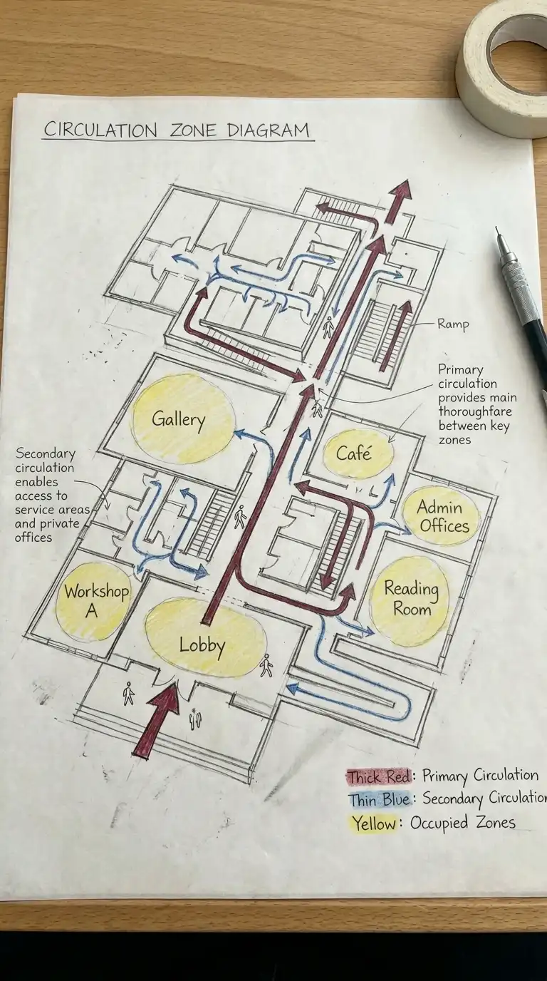
6. The Circulation Zone Diagram
The circulation zone diagram shows zones for movement separate from zones for occupation. Primary circulation (main corridors, stairs, elevators) is one zone. Secondary circulation (hallways, ramps) is another zone. Occupied zones (rooms, offices, galleries) are separate.
This diagram is ideal for building planning and accessibility studies. The emotional effect is movement-focused, separated, and efficient.
Quick Tips
- Primary circulation = thick arrows or wide zones.
- Secondary circulation = thin arrows or narrow zones.
- Occupied zones = bubbles or coloured areas.
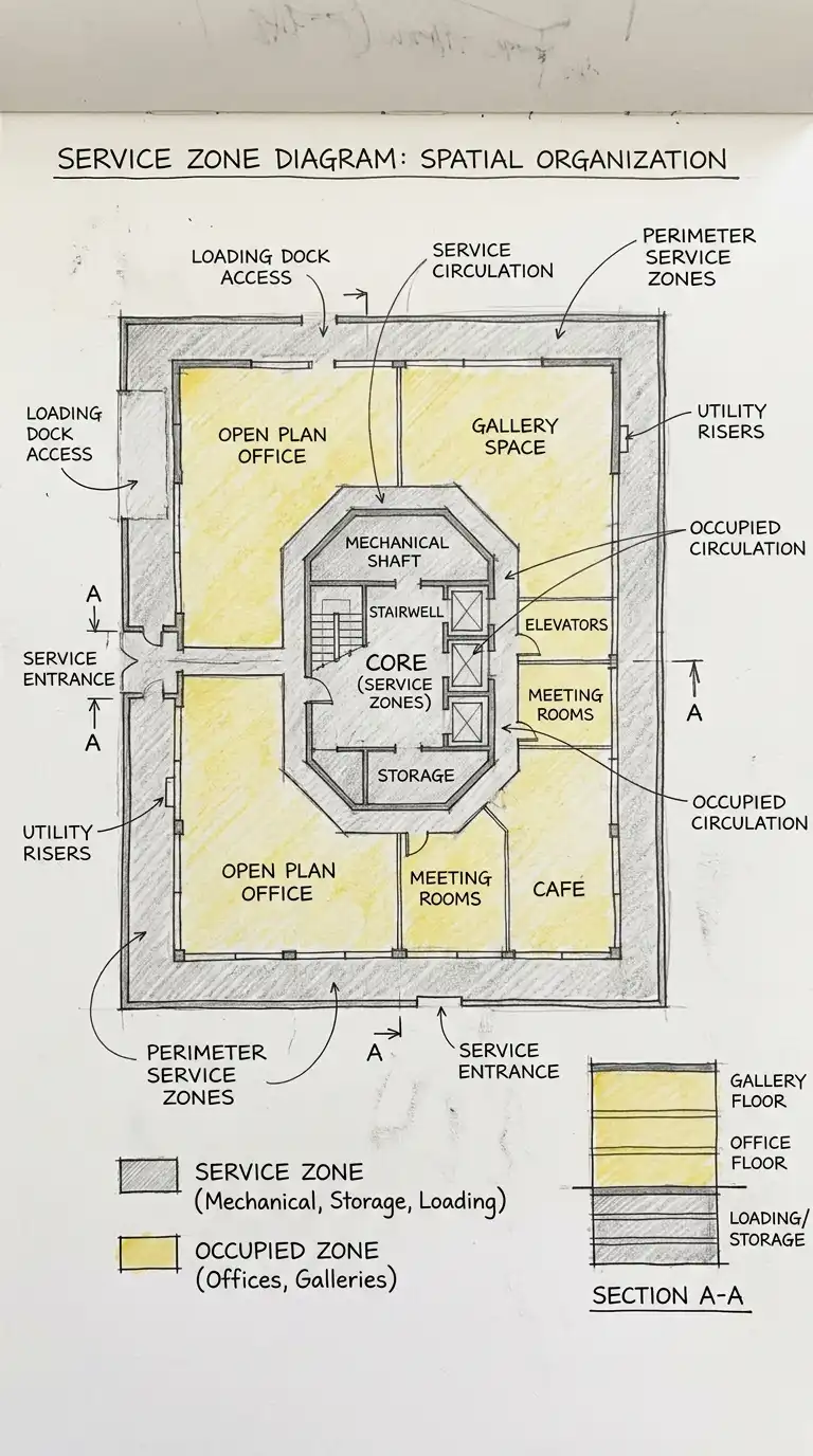
7. The Service Zone Diagram
The service zone diagram shows zones for service functions separate from occupied functions. Service zones include mechanical rooms, electrical rooms, storage, loading docks, and trash rooms. Service zones are often placed at the perimeter or in the core.
This diagram is ideal for building planning and industrial design. The emotional effect is service-focused, separated, and efficient.
Quick Tips
- Service zones = one colour (e.g., grey).
- Occupied zones = another colour (e.g., yellow).
- Service zones should be at the perimeter or in the core.
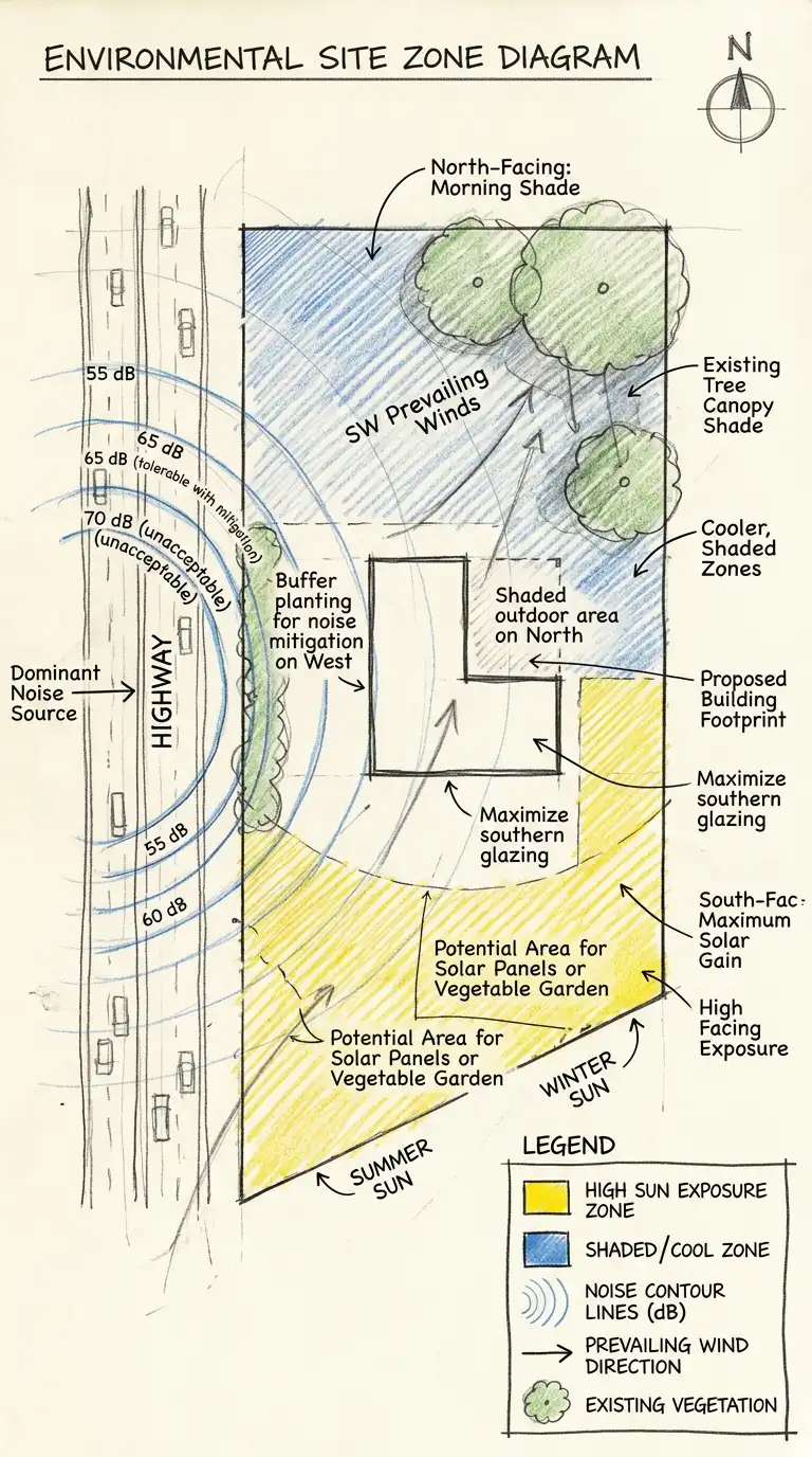
8. The Environmental Zone Diagram
The environmental zone diagram shows zones with different environmental conditions. Sun zones are south-facing (northern hemisphere). Shade zones are north-facing. Wind zones are exposed or sheltered. Noise zones are quiet or loud. The environmental zone diagram is a site analysis tool.
This diagram is ideal for site planning and passive design. The emotional effect is environmental, analytical, and climatic.
Quick Tips
- Sun zones = warm colours (yellow, orange).
- Shade zones = cool colours (blue, green).
- Noise zones = contour lines or gradients.
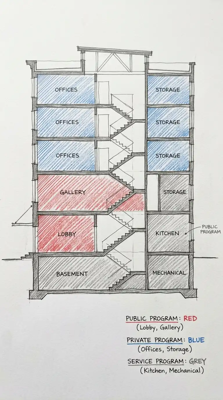
9. The Program Zone Diagram
The program zone diagram shows the distribution of program functions across a building. Public program (lobby, cafe, gallery) is one zone. Private program (offices, storage, mechanical) is another zone. Service program (kitchen, loading, maintenance) is another zone.
This diagram is ideal for program analysis and building planning. The emotional effect is programmatic, analytical, and clear.
Quick Tips
- Public program = warm colours (red, orange).
- Private program = cool colours (blue, green).
- Service program = neutral colours (grey, brown).
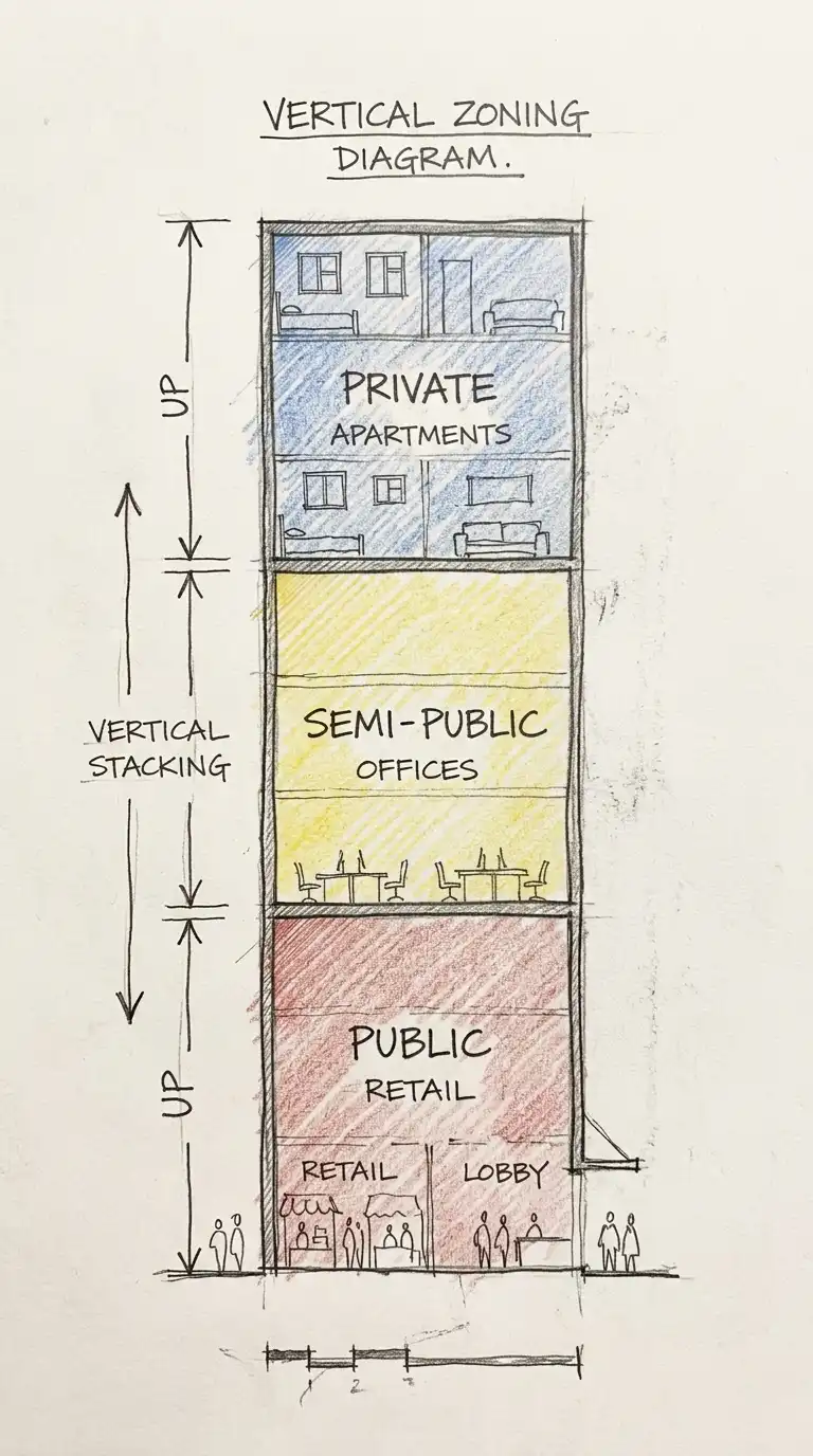
10. The Vertical Zoning Diagram
The vertical zoning diagram shows zones stacked vertically. Ground floor is public. Middle floors are semi-public. Top floors are private. The vertical zoning diagram is ideal for mixed-use buildings and skyscrapers.
This diagram is ideal for tall buildings and urban design. The emotional effect is vertical, stacked, and hierarchical.
Quick Tips
- Ground floor = public (retail, lobby).
- Middle floors = semi-public (offices, hotel).
- Top floors = private (residential, penthouse).
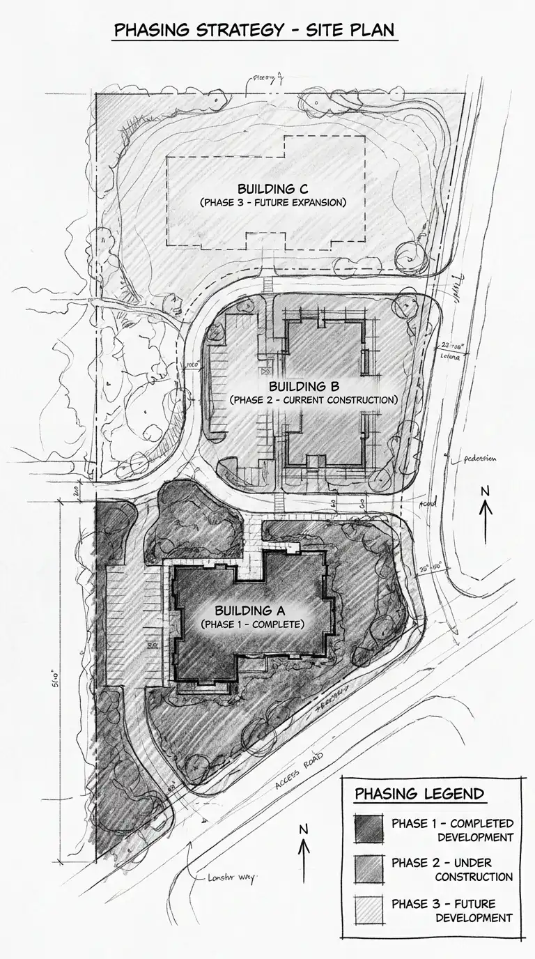
11. The Phasing Diagram
The phasing diagram shows how zones are built over time. Phase 1 is the first zone. Phase 2 is the next zone. Phase 3 is the final zone. The phasing diagram is ideal for large projects and master plans.
This diagram is ideal for master planning and construction sequencing. The emotional effect is temporal, phased, and sequential.
Quick Tips
- Phase 1 = darkest colour.
- Phase 2 = medium colour.
- Phase 3 = lightest colour.
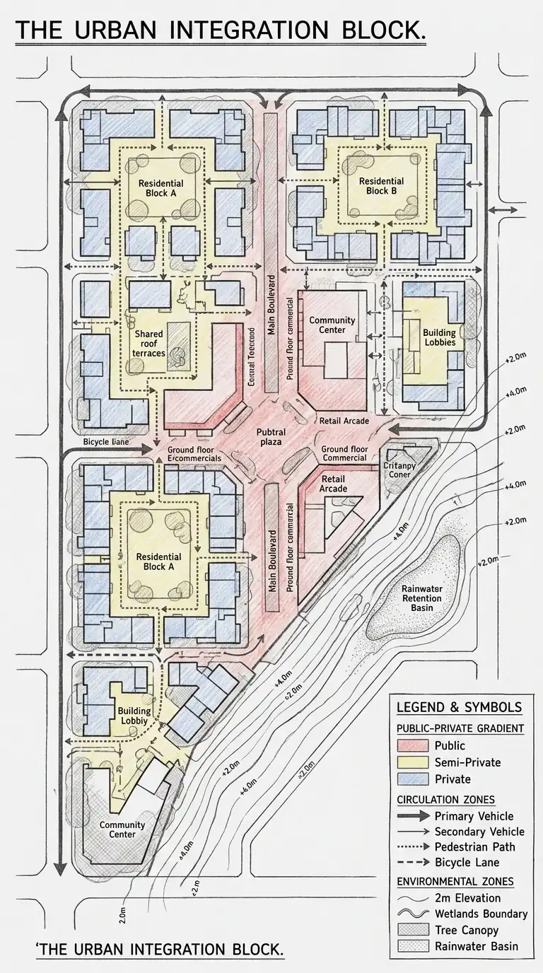
12. The Hybrid Zoning Diagram
The hybrid zoning diagram combines multiple zoning types on one drawing. Public-private gradient, circulation zones, and environmental zones are shown together. The hybrid diagram is complex and dense. It requires a clear legend.
This diagram is ideal for comprehensive analysis and complex projects. The emotional effect is dense, complex, and synthesised.
Quick Tips
- Use a consistent colour code across all zoning types.
- Include a legend explaining every colour, line, and symbol.
- Keep the diagram readable — do not overload it.
Final Thoughts
A zoning diagram is not a floor plan. It has no walls, no doors, no dimensions. It is a diagram of organisation. It answers the question: what goes where? A public-private gradient shows privacy. A bubble diagram shows adjacency. A colour-coded plan shows specific locations. A layer diagram shows complexity. A threshold diagram shows edges. A circulation zone diagram shows movement. A service zone diagram shows support. An environmental zone diagram shows climate. A program zone diagram shows function. A vertical zoning diagram shows height. A phasing diagram shows time. A hybrid diagram shows everything.
These 12 zoning diagrams are not mutually exclusive. A colour-coded plan can have thresholds. A bubble diagram can be vertical. A hybrid diagram can combine public-private gradient, circulation, and environment. The best zoning diagrams are not the most beautiful — they are the most informative. They answer the questions that matter before a single wall is drawn. They are not plans — they are ideas about plans.
