 Skip to content
 Architecture illustration is the art of representing buildings, spaces, and environments through drawing. Unlike a technical drawing, which communicates precise dimensions and construction methods, an architecture illustration communicates atmosphere, light, material, and mood. It is not for builders — it is for clients, competitions, and the public. A great architecture illustration makes you feel like you are there.
The Purpose of Architecture Illustration
An architecture illustration answers questions that technical drawings cannot. What does this space feel like? How does light fall across this wall? What is the relationship between inside and outside? Is the building warm or cool, inviting or monumental, calm or dramatic? Technical drawings tell you how the building is built. Illustrations tell you how it feels.
The Elements of Architecture Illustration
Line
Line is the foundation of any illustration. Lines can be thick or thin, dark or light, continuous or broken, straight or curved. Thick lines define edges and create weight. Thin lines suggest detail and delicacy. Broken lines imply transparency or distance. Curved lines suggest movement and softness. Straight lines suggest stability and order.
In a pencil illustration, lines are varied by pressure. A heavy hand creates a dark, thick line. A light hand creates a pale, thin line. In an ink illustration, lines are varied by nib size and by hatching (parallel lines) or cross-hatching (intersecting lines). In a digital illustration, lines are varied by stroke weight and opacity.
Value
Value is the lightness or darkness of a surface. Value creates contrast, depth, and mood. High-contrast illustrations have bright whites and dark blacks. Low-contrast illustrations have mostly middle greys. Value is created by shading: hatching, cross-hatching, stippling, or smooth gradients.
In a pencil illustration, value is created by the amount of graphite on the paper. More pressure creates darker values. Softer pencils (4B, 6B) create darker values than harder pencils (2H, 4H). In an ink illustration, value is created by the density of hatching. Close hatching creates dark values. Sparse hatching creates light values. In a digital illustration, value is created by opacity and layer blending.
Shadow
Shadow is the absence of light. Shadows define form, anchor buildings to the ground, and create mood. A cast shadow is the shadow of a building or object falling on the ground or on another surface. A form shadow is the shadow on the side of a building away from the light. A core shadow is the darkest part of a form shadow, where light is completely blocked.
Shadows must be consistent. If the light comes from the top-left, all shadows must fall to the bottom-right. If the light is the sun, shadows are parallel. If the light is a lamp, shadows radiate from the lamp. Inconsistent shadows destroy the illusion of depth.
Texture
Texture is the visual representation of material. Smooth concrete is rendered with flat, even values. Rough stone is rendered with broken, irregular marks. Wood grain is rendered with parallel wavy lines. Brick is rendered with a grid of rectangles. Glass is rendered with reflections of sky and clouds.
Texture is created by mark-making. Hatching suggests smooth surfaces. Stippling (dots) suggests rough or granular surfaces. Scumbling (scribbled circles) suggests soft or organic surfaces. Erasing creates highlights and suggests reflective surfaces.
Atmosphere
Atmosphere is the overall mood of the illustration. A sunny day has high contrast, sharp shadows, and bright highlights. An overcast day has low contrast, soft shadows, and even values. A foggy day has very low contrast, no cast shadows, and pale, muted values. A night scene has very high contrast, deep blacks, and glowing artificial lights.
Atmosphere is created by value range, shadow sharpness, and colour (if used). High contrast creates drama and energy. Low contrast creates calm and mystery. Warm colours (yellow, orange, red) create warmth and comfort. Cool colours (blue, green, purple) create coolness and distance.
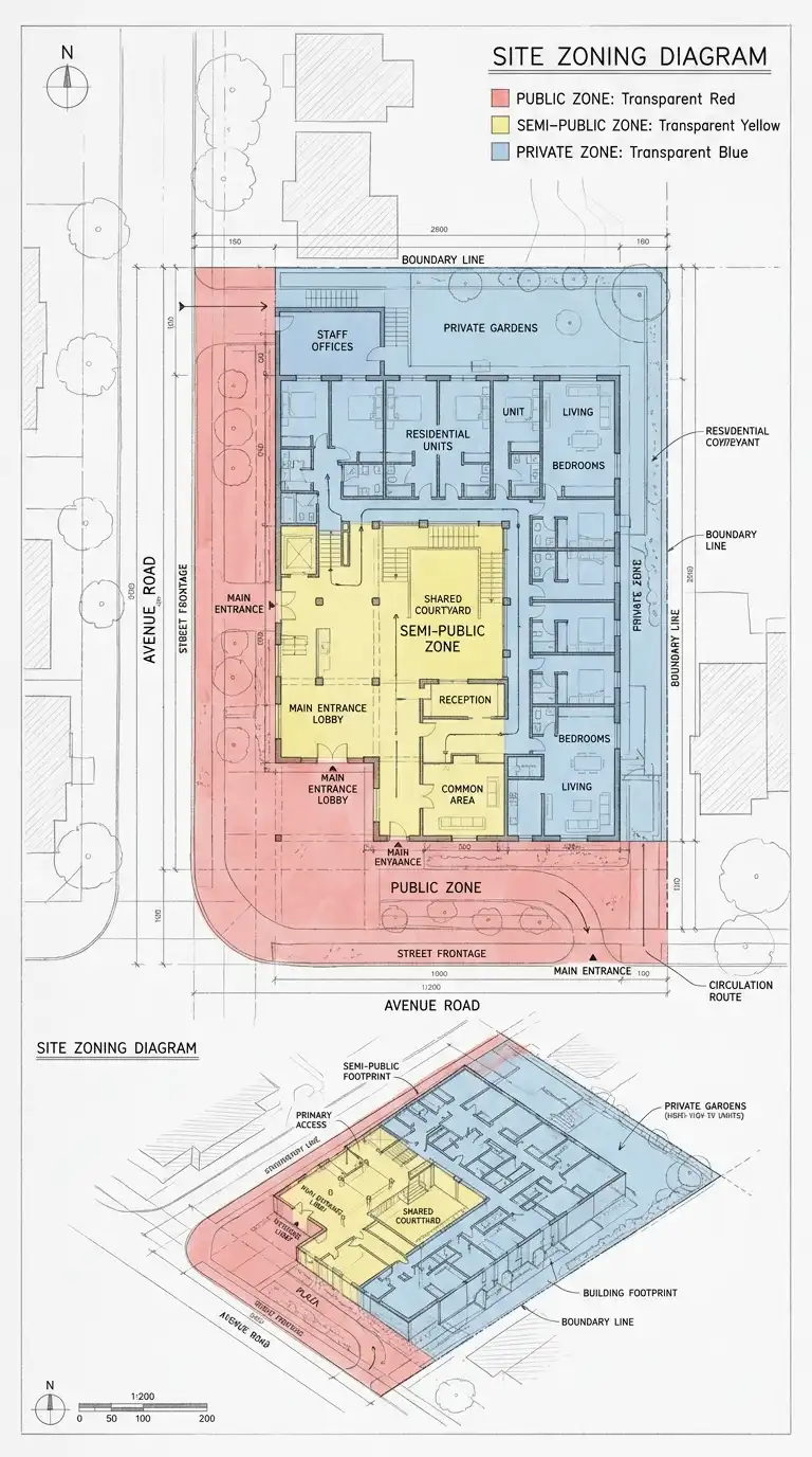
The Types of Architecture Illustration
Exterior Perspective
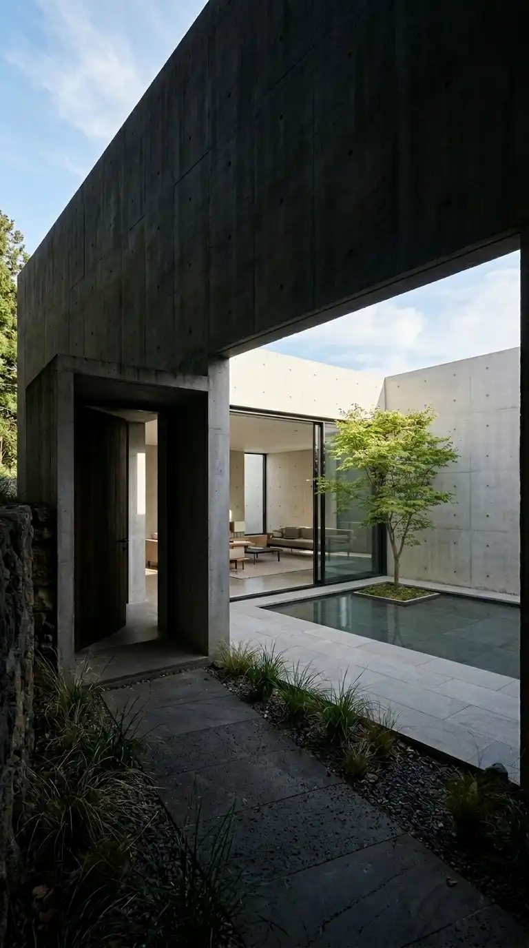
The exterior perspective shows the building from outside, in three dimensions. The building is the subject. The sky, ground, trees, and people are context. The exterior perspective answers: what does the building look like from the street? From the garden? From across the water?
The exterior perspective is usually drawn in two-point perspective (showing two sides of the building) or one-point perspective (showing one side straight on). Three-point perspective is used for tall buildings seen from below or above.

Interior Perspective
The interior perspective shows a room or space from inside. The space is the subject. Furniture, lighting, and people are context. The interior perspective answers: what does it feel like to be inside this space? Is it tall or low? Light or dark? Open or intimate?
The interior perspective is usually drawn in one-point perspective (looking straight down a room) or two-point perspective (looking into a corner). The vanishing point is often placed at eye level (approximately 150cm above the floor).
Sectional Perspective
The sectional perspective combines a building section (a vertical cut) with a perspective view. The cut reveals the interior structure and spaces. The perspective shows depth. The sectional perspective is the most informative architectural illustration. It shows both the vertical relationships (section) and the three-dimensional experience (perspective).
Elevation
The elevation shows the building as a flat, two-dimensional facade. There is no perspective — all lines are vertical or horizontal. The elevation is not an illustration in the traditional sense, but it can be illustrated with shadow, texture, and context (trees, sky, people). An illustrated elevation is more approachable than a technical elevation.
Axonometric
The axonometric shows the building in three dimensions without perspective. All lines are parallel. The axonometric is measurable — you can scale distances directly from the drawing. The axonometric is ideal for diagrams and exploded views. It is less realistic than a perspective but more informative.
The Process of Architecture Illustration
Step 1: Understand the Building
Before drawing, study the building. What is its form? Its materials? Its site? Its light? What is the most important thing about this building? The illustration should communicate that thing. If the building is about light, emphasise light. If it is about material, emphasise texture. If it is about form, emphasise mass and shadow.
Step 2: Choose the View
Choose the view that tells the story. An exterior perspective from the main entrance shows the building as visitors first see it. An interior perspective of the main hall shows the most important space. A sectional perspective shows how the building works. A view from above (bird’s-eye) shows the building in its site. A view from below (worm’s-eye) makes the building monumental.
Step 3: Establish the Perspective
Draw the horizon line and vanishing points. Draw the building in simple boxes first. Add details later. Check that all vertical lines are vertical. Check that all horizontal lines go to the correct vanishing points. A perspective with errors is unconvincing.
Step 4: Add Value and Shadow
Establish the light direction. Shade the surfaces away from the light. Add cast shadows on the ground. Add form shadows on the building. Keep shadows consistent. The darkest shadow is usually under the eaves, under the roof, and in deep corners.
Step 5: Add Texture
Add material texture. Brick: a grid of rectangles. Stone: irregular broken shapes. Wood: parallel wavy lines. Concrete: smooth with occasional formwork marks. Glass: reflections of sky and trees. Do not over-texture. Too much texture is noise. Too little texture is flat.
Step 6: Add Context
Add sky, ground, trees, and people. The sky sets the atmosphere: a bright sky with clouds is cheerful; an overcast sky is calm; a sunset is dramatic. Trees soften the building and provide scale. People provide scale and activity. A building without people is a model. A building with people is a place.
Step 7: Refine and Adjust
Step back. Look at the illustration from a distance. What works? What does not? Is the light consistent? Are the shadows dark enough? Is the building the subject, or does the context compete? Adjust. Erase. Darken. Lighten. Add detail where needed. Remove detail where distracting.
Materials for Architecture Illustration
Pencil
Pencil is the most direct and expressive medium. Soft pencils (4B, 6B, 8B) create dark, soft lines and are good for shading. Hard pencils (2H, 4H, 6H) create light, crisp lines and are good for detail. Mechanical pencils (0.3mm, 0.5mm, 0.7mm) create consistent lines and are good for precision.
Pencil illustrations are often scanned and darkened digitally. Pencil is erasable, forgiving, and cheap. Pencil does not reproduce well in print without enhancement.
Ink
Ink is permanent and high-contrast. Ink lines are crisp and dark. Ink is not erasable — mistakes must be covered or accepted. Ink is ideal for line drawings and hatched shading. Ink pens come in various nib sizes: 0.1mm for fine detail, 0.5mm for general lines, 1.0mm for thick outlines.
Ink illustrations reproduce perfectly in print and digital. Ink is unforgiving but beautiful.
Watercolour
Watercolour is unpredictable and expressive. Watercolour washes create atmosphere, light, and mood. Watercolour is not precise — it is poetic. Watercolour is often combined with ink (line and wash). The ink provides structure. The watercolour provides colour and atmosphere.
Watercolour requires heavy paper (300gsm or heavier) that will not warp. Watercolour is difficult to correct but rewarding.
Digital
Digital illustration is created on a computer or tablet using software like Photoshop, Procreate, or SketchUp. Digital illustration is flexible, editable, and precise. Digital can mimic pencil, ink, watercolour, or create new styles impossible with traditional media.
Digital illustration requires a drawing tablet (Wacom, iPad with Apple Pencil) and software. Digital is the standard for professional architectural illustration.
Common Mistakes in Architecture Illustration
Inconsistent Light
The most common mistake. If the sun is from the top-left, all shadows must fall to the bottom-right. A shadow on the left side of a building while another shadow is on the right side destroys the illusion. Establish the light direction before you start and check every shadow.
Flat Values
The second most common mistake. All values are medium grey. There are no bright whites and no dark blacks. The illustration looks flat and dead. Push the contrast. Make the sunlit surfaces almost white. Make the shadows almost black. An illustration with high contrast is alive.
Over-rendering
The third most common mistake. Every brick is drawn. Every leaf is detailed. The illustration is so busy that the building disappears. Simplify. Suggest texture, do not draw every brick. Leave some areas loose. The eye fills in the gaps.
Under-rendering
The opposite mistake. The illustration is too simple. The building has no texture, no shadow, no context. It looks like a diagram, not a place. Add value, shadow, texture, and context. Make the building feel real.
Wrong Perspective
Lines that should be vertical are slanted. Lines that should go to the vanishing point go elsewhere. The building looks wrong, even if the viewer cannot say why. Check your perspective. Use a ruler. Measure. Redraw.
Conclusion
Architecture illustration is not technical drawing. It is not art for art’s sake. It is communication. A great illustration tells the story of a building: its light, its material, its atmosphere, its place. It makes the viewer feel something. It makes the viewer want to be there.
The best architecture illustrators are not the most technically skilled. They are the most observant. They see the light, the shadow, the texture, the mood. They know what to include and what to leave out. They know that a suggestion of a brick is better than every brick. They know that a shadow is not just dark — it is cool, it is soft, it is alive.
Architecture illustration is a craft. It takes practice. It takes patience. It takes hundreds of bad drawings to make one good drawing. But the good drawing is worth it. The good drawing makes a building real. It makes a building a place. It makes a building a home.
